Socrata is amazingly handy for open data
The Socrata package makes it easy to access API calls built around SODA for open data access. If you try to skip the Socrata part, you usually only get a fraction of the available data.
install.packages("RSocrata")
library(RSocrata)
SchoolSpend <- read.socrata("https://data.oregon.gov/resource/c7av-ntdz.csv")
The first bit of data that I found details various bits about spending and students in Oregon school districts. I want to look at a few basics of this. There is a lot more to plot but this is enough for now.
The Data
I found this on Oregon’s open data portal. What do I have?
library(skimr)
skim(SchoolSpend)| Name | SchoolSpend |
| Number of rows | 2205 |
| Number of columns | 10 |
| _______________________ | |
| Column type frequency: | |
| character | 3 |
| numeric | 7 |
| ________________________ | |
| Group variables | None |
Variable type: character
| skim_variable | n_missing | complete_rate | min | max | empty | n_unique | whitespace |
|---|---|---|---|---|---|---|---|
| county_name | 0 | 1 | 4 | 10 | 0 | 36 | 0 |
| district_number | 0 | 1 | 9 | 33 | 0 | 375 | 0 |
| school_year | 0 | 1 | 10 | 10 | 0 | 13 | 0 |
Variable type: numeric
| skim_variable | n_missing | complete_rate | mean | sd | p0 | p25 | p50 | p75 | p100 | hist |
|---|---|---|---|---|---|---|---|---|---|---|
| district_id | 0 | 1 | 2094.94 | 189.48 | 1894.0 | 1999.00 | 2085.00 | 2190.00 | 4131.00 | ▇▁▁▁▁ |
| operating_cost_per_student | 0 | 1 | 10337.76 | 7762.80 | 0.0 | 7252.19 | 8596.27 | 10797.39 | 170210.60 | ▇▁▁▁▁ |
| student_count | 0 | 1 | 2900.14 | 6105.83 | 0.0 | 234.00 | 872.00 | 2934.00 | 55321.00 | ▇▁▁▁▁ |
| state_student_count | 0 | 1 | 552475.19 | 5910.95 | 539105.0 | 549169.00 | 552161.00 | 558366.00 | 561354.00 | ▂▂▇▃▆ |
| operating_cost | 0 | 1 | 22756620.87 | 49527514.39 | 9881.0 | 2458166.78 | 7089257.97 | 22617257.11 | 513891919.14 | ▇▁▁▁▁ |
| state_operating_cost | 0 | 1 | 4337006498.57 | 697307559.84 | 948447366.8 | 3889552066.13 | 4198534676.94 | 5144636555.37 | 5248233458.10 | ▁▁▁▇▆ |
| state_operating_cost_per_student | 0 | 1 | 7839.08 | 1195.04 | 1759.3 | 7044.24 | 7636.57 | 9164.69 | 9384.06 | ▁▁▁▇▆ |
How many school districts per county?
library(magrittr); library(hrbrthemes)##
## Attaching package: 'magrittr'## The following object is masked from 'package:purrr':
##
## set_names## The following object is masked from 'package:tidyr':
##
## extractSchoolSpend %>% group_by(county_name, school_year) %>% tally() %>% mutate(school_year = as.Date(school_year, format = "%m/%d/%Y")) %>% filter(school_year == max(school_year)) %>% ggplot() + aes(x=fct_reorder(county_name, n), y=n, fill=county_name) + geom_col() + coord_flip() + guides(fill=FALSE) + labs(x= "County", y="Number of School Districts") + theme_minimal()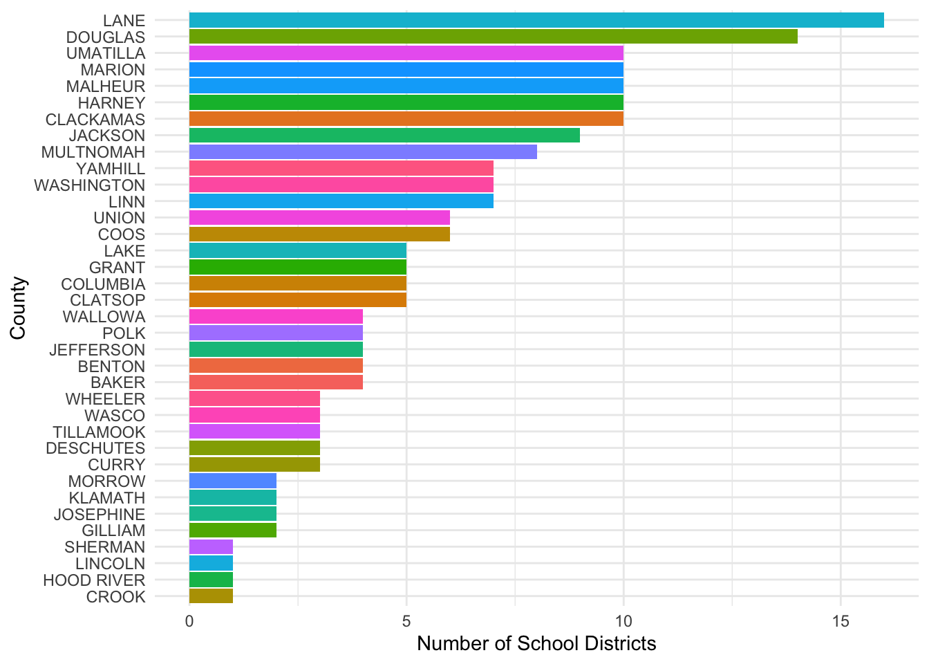
By Students?
SchoolSpend %>% group_by(county_name) %>% mutate(school_year = as.Date(school_year, format = "%m/%d/%Y")) %>% filter(school_year == max(school_year)) %>% summarise(Students = sum(student_count), Year = mean(school_year), County = as.factor(county_name)) %>% unique() -> Dat## `summarise()` has grouped output by 'county_name'. You can override using the `.groups` argument.ggplot(Dat) + aes(x=fct_reorder(County, -Students), y=Students, fill=county_name) + geom_col() + coord_flip() + guides(fill=FALSE) + labs(x= "County", y="Students") + theme_minimal()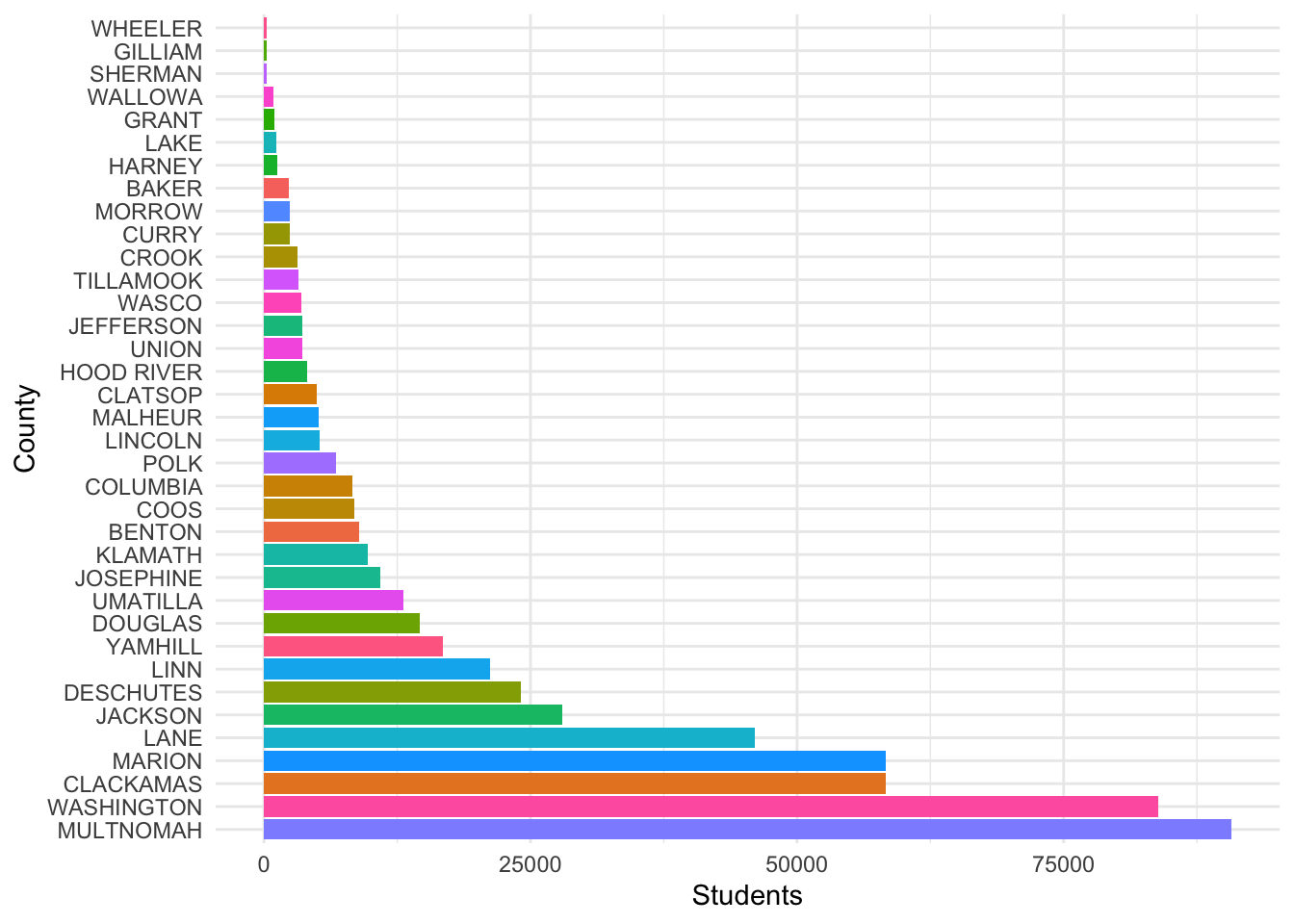
There are a number of other bits of data organized by year and district. There is certainly more to examine, but then I found this.
Voter Registration Data
The database of Voter Registrations in Oregon is also available and easily accessible.
VoterReg <- read.socrata("https://data.oregon.gov/resource/6a4f-ecbi.csv")
VoterReg %>% filter(sysdate == "2020-11-03") %>% group_by(county) %>% summarise(Voters = sum(count_v_id)) %>% ggplot(., aes(x=fct_reorder(county, Voters), y=Voters, label=Voters)) + geom_col(fill="white", color="skyblue") + geom_text(size=2.2) + coord_flip() + labs(x="County", y="Registered Voters") + theme_minimal() -> Plot1
Plot1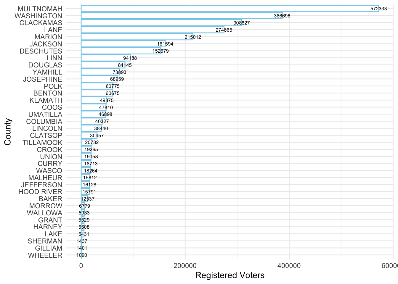
library(plotly); library(widgetframe)
ggp1 <- ggplotly(Plot1)
frameWidget(ggp1)
The Balance of Registrations
CurrVR <- VoterReg %>% filter(sysdate == "2020-11-03")
CurrVR$DRE <- "Other"
CurrVR$DRE[CurrVR$party=="Democrat"] <- "Democrat"
CurrVR$DRE[CurrVR$party=="Republican"] <- "Republican"
CurrVR %>% group_by(county) %>% mutate(Voters = sum(count_v_id)) %>% ggplot(., aes(x=fct_reorder(county, Voters), y=Voters, label=Voters)) + geom_col() + geom_text(size=2.2) + coord_flip() + labs(x="County", y="Registered Voters") + theme_minimal()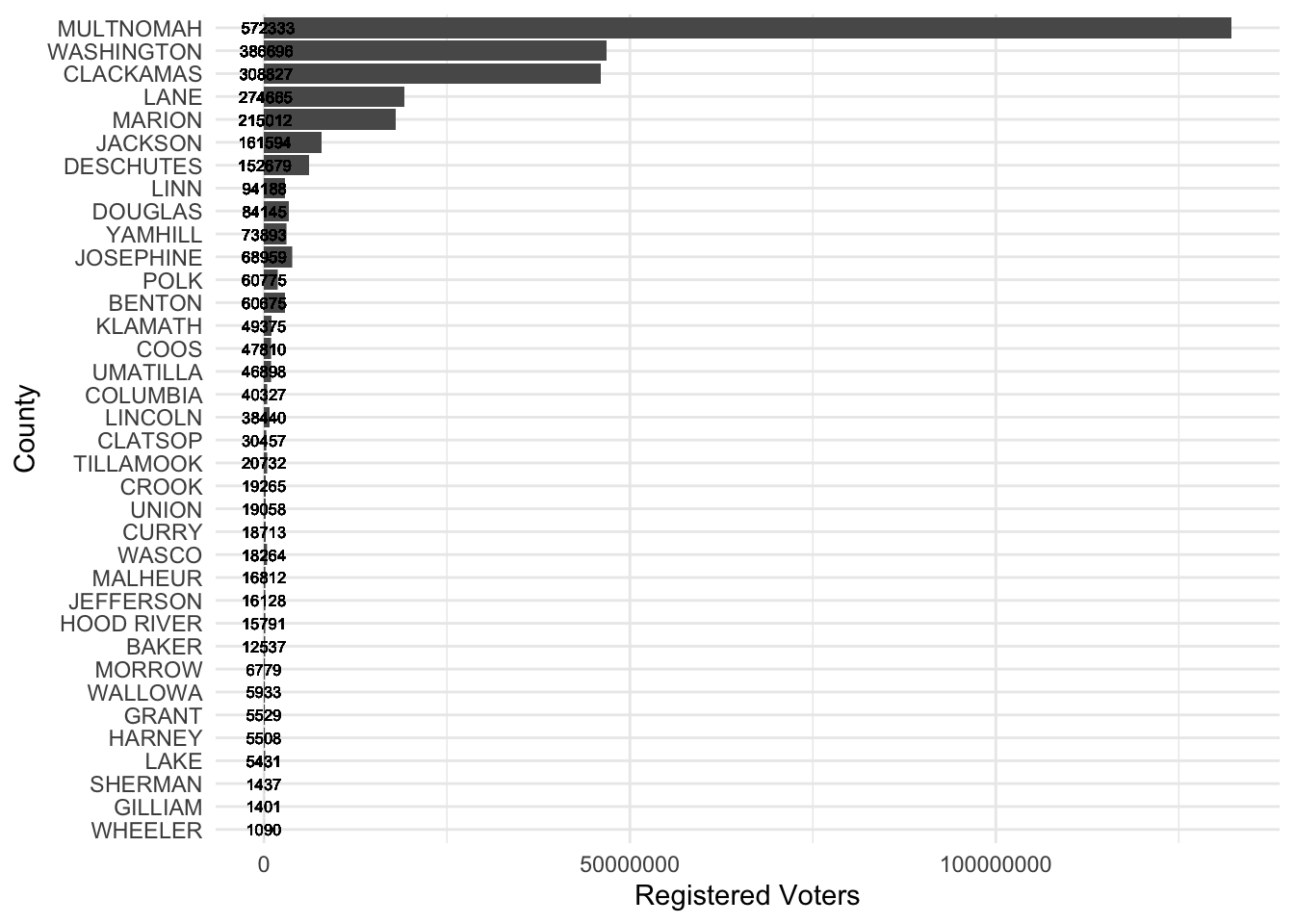
The Plot by Party
Now let me split these up by grouping and plot them.
CurrVR %>% group_by(county, DRE) %>% summarise(Voters = sum(count_v_id)) %>%
ggplot(.) +
 aes(x = fct_reorder(county, Voters), y=Voters, fill = DRE) +
 geom_col() + scale_fill_viridis_d() +
 coord_flip() +
 theme_minimal() + labs(x="County")
## `summarise()` has grouped output by 'county'. You can override using the `.groups` argument.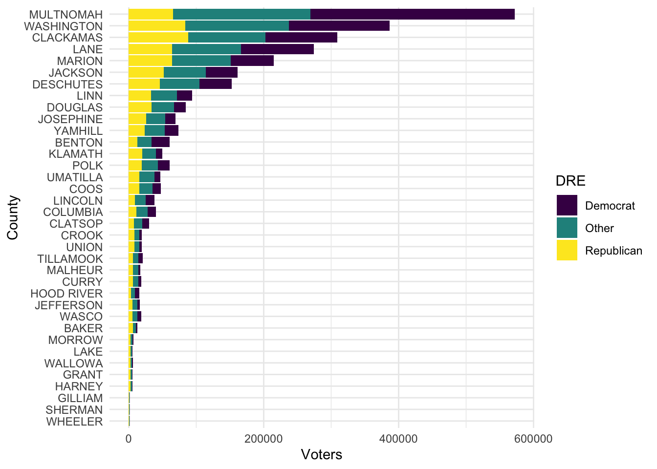
Robert W. Walker
Associate Professor of Quantitative Methods
My research interests include causal inference, statistical computation and data visualization.