NYT COVID Forecast Aggregation
New York Times Data on COVID
I will grab the dataset from the NYT COVID data github. I will create two variables, New Cases and New Deaths to model. The final line uses aggregation to create the national data.
NB: This file takes a really long time to run; forecasting deaths took just under six hours.
NYT.COVIDN <- read.csv(url("https://raw.githubusercontent.com/nytimes/covid-19-data/master/us-states.csv"))
# Define a tsibble; the date is imported as character so mutate that first.
NYT.COVID <- NYT.COVIDN %>%
    mutate(date = as.Date(date)) %>%
    as_tsibble(index = date, key = state) %>%
    group_by(state) %>%
    mutate(New.Cases = difference(cases), New.Deaths = difference(deaths)) %>%
    filter(!(state %in% c("Guam", "Puerto Rico", "Virgin Islands", "Northern Mariana Islands")))
NYT.COVID <- NYT.COVID %>%
    mutate(New.CasesP = as.numeric(New.Cases >= 0) * New.Cases, New.DeathsP = as.numeric(New.Deaths >=
        0) * New.Deaths)
NYTAgg.COVID <- NYT.COVID %>%
    aggregate_key(state, New.CasesP = sum(New.CasesP, na.rm = TRUE), New.DeathsP = sum(New.DeathsP,
        na.rm = TRUE), New.Cases = sum(New.Cases, na.rm = TRUE), New.Deaths = sum(New.Deaths,
        na.rm = TRUE), cases = sum(cases, na.rm = TRUE), deaths = sum(deaths, na.rm = TRUE)) %>%
    filter(date > as.Date("2020-03-31")) %>%
    mutate(Day.of.Week = as.factor(wday(date, label = TRUE)))
A basic visual for verification. First the subseries.
library(patchwork)
plot1 <- NYTAgg.COVID %>%
    filter(!is_aggregated(state)) %>%
    autoplot(New.CasesP) + guides(color = FALSE)
plot2 <- NYTAgg.COVID %>%
    filter(!is_aggregated(state)) %>%
    autoplot(New.DeathsP) + guides(color = FALSE)
plot1/plot2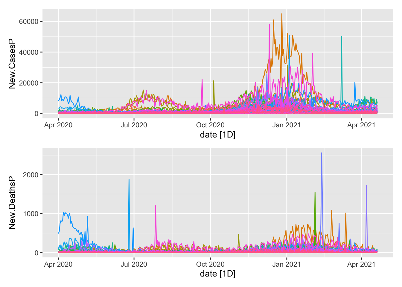
Now the aggregates.
plot1 <- NYTAgg.COVID %>%
    filter(is_aggregated(state)) %>%
    autoplot(New.CasesP)
plot2 <- NYTAgg.COVID %>%
    filter(is_aggregated(state)) %>%
    autoplot(New.DeathsP)
plot1/plot2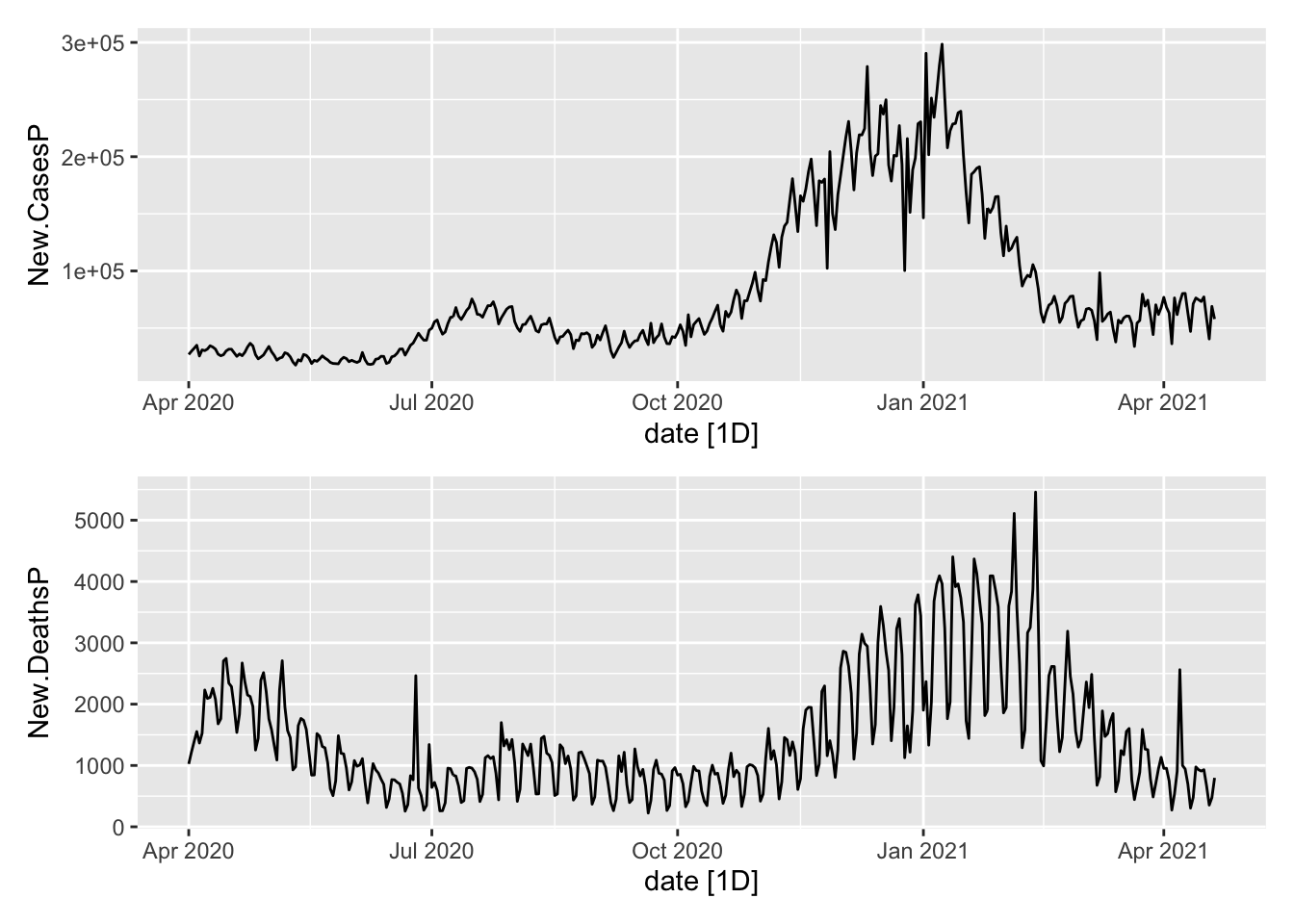
Are there day of week effects?
NYTAgg.COVID %>%
    model(TSLM(New.CasesP ~ Day.of.Week)) %>%
    glance() %>%
    filter(p_value < 0.05)
# A tibble: 14 x 16
state .model r_squared adj_r_squared sigma2 statistic p_value df
<chr*> <chr> <dbl> <dbl> <dbl> <dbl> <dbl> <int>
1 Arkansas … TSLM(Ne… 0.0471 0.0320 6.67e5 3.12 5.42e- 3 7
2 Connecticut… TSLM(Ne… 0.263 0.251 1.27e6 22.5 1.16e-22 7
3 District of… TSLM(Ne… 0.0406 0.0254 6.64e3 2.67 1.51e- 2 7
4 Hawaii … TSLM(Ne… 0.0696 0.0548 4.76e3 4.71 1.22e- 4 7
5 Idaho … TSLM(Ne… 0.0792 0.0646 2.09e5 5.42 2.17e- 5 7
6 Iowa … TSLM(Ne… 0.0330 0.0176 9.05e5 2.15 4.74e- 2 7
7 Kansas … TSLM(Ne… 0.302 0.291 1.47e6 27.2 5.76e-27 7
8 Louisiana … TSLM(Ne… 0.141 0.127 1.38e6 10.3 1.30e-10 7
9 Michigan … TSLM(Ne… 0.101 0.0871 6.94e6 7.11 3.44e- 7 7
10 Mississippi… TSLM(Ne… 0.0586 0.0437 4.27e5 3.93 8.08e- 4 7
11 Rhode Islan… TSLM(Ne… 0.216 0.204 2.81e5 17.4 9.29e-18 7
12 South Dakot… TSLM(Ne… 0.0330 0.0177 1.35e5 2.15 4.69e- 2 7
13 Texas … TSLM(Ne… 0.0341 0.0188 4.58e7 2.22 4.02e- 2 7
14 Washington … TSLM(Ne… 0.0675 0.0527 8.77e5 4.56 1.74e- 4 7
# … with 8 more variables: log_lik <dbl>, AIC <dbl>, AICc <dbl>, BIC <dbl>,
# CV <dbl>, deviance <dbl>, df.residual <int>, rank <int>In 12 states, there appear to be and in a few of them, those effects are large. Modelling this covariate seems useful. At the same time, this does nothing about the broad trends.
Training and Testing
That gives me the data that I want; now let me slice it up into training and test sets.
COVID.Agg.Test <- NYTAgg.COVID %>%
    as_tibble() %>%
    group_by(state) %>%
    slice_tail(n = 14) %>%
    ungroup() %>%
    as_tsibble(index = date, key = state)
COVID.Agg.Train <- anti_join(NYTAgg.COVID, COVID.Agg.Test) %>%
    as_tsibble(index = date, key = state)
Model Fitting
Fit some models to the data.
COVID.Models <- COVID.Agg.Train %>%
    model(WDARIMA = ARIMA(New.CasesP ~ Day.of.Week))
Forecast the models.
COVIDFC <- COVID.Models %>%
    forecast(new_data = COVID.Agg.Test)
COVIDFC %>%
    accuracy(COVID.Agg.Test)
# A tibble: 52 x 11
.model state .type ME RMSE MAE MPE MAPE MASE RMSSE
<chr> <chr*> <chr> <dbl> <dbl> <dbl> <dbl> <dbl> <dbl> <dbl>
1 WDARIMA Alabama … Test 302. 547. 329. 46.2 55.3 NaN NaN
2 WDARIMA Alaska … Test -13.4 82.3 66.0 -Inf Inf NaN NaN
3 WDARIMA Arizona … Test 54.6 355. 317. 3.33 49.3 NaN NaN
4 WDARIMA Arkansas … Test 72.6 104. 85.7 78.0 84.8 NaN NaN
5 WDARIMA California … Test 9.47 726. 465. -3.28 15.8 NaN NaN
6 WDARIMA Colorado … Test 261. 553. 492. 6.21 30.6 NaN NaN
7 WDARIMA Connecticut … Test -65.3 336. 246. NaN Inf NaN NaN
8 WDARIMA Delaware … Test 41.6 70.2 63.5 7.32 19.6 NaN NaN
9 WDARIMA District of Co… Test 0.615 32.6 21.3 -6.40 18.8 NaN NaN
10 WDARIMA Florida … Test 919. 1550. 1238. 5.11 24.9 NaN NaN
# … with 42 more rows, and 1 more variable: ACF1 <dbl>Look at the aggregates.
COVIDFC %>%
    filter(is_aggregated(state)) %>%
    autoplot(NYTAgg.COVID %>%
        filter(date > as.Date("2021-03-01")))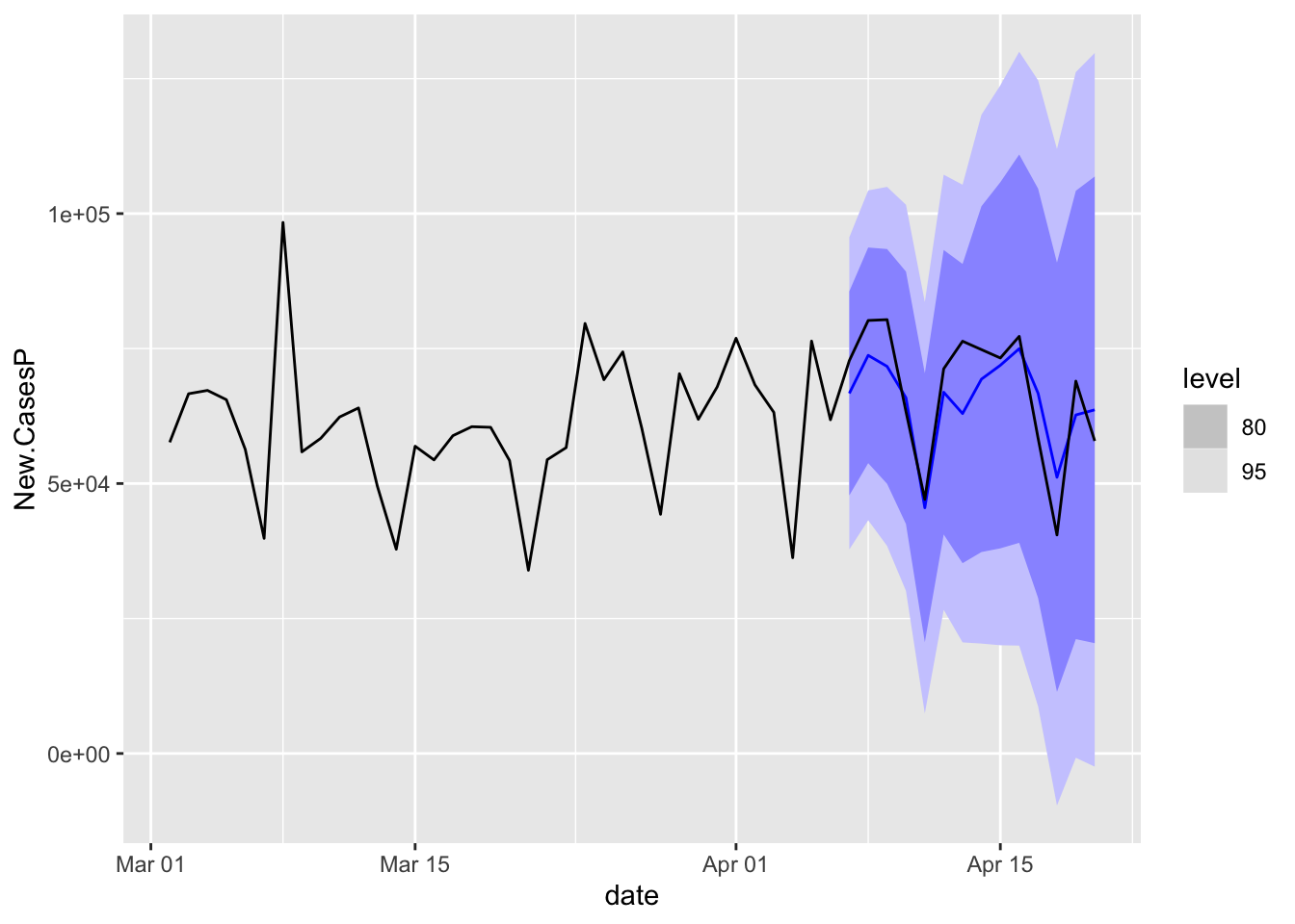
Look at Oregon.
COVIDFC %>%
    filter(state == "Oregon") %>%
    autoplot(NYTAgg.COVID %>%
        filter(date > as.Date("2021-03-01")))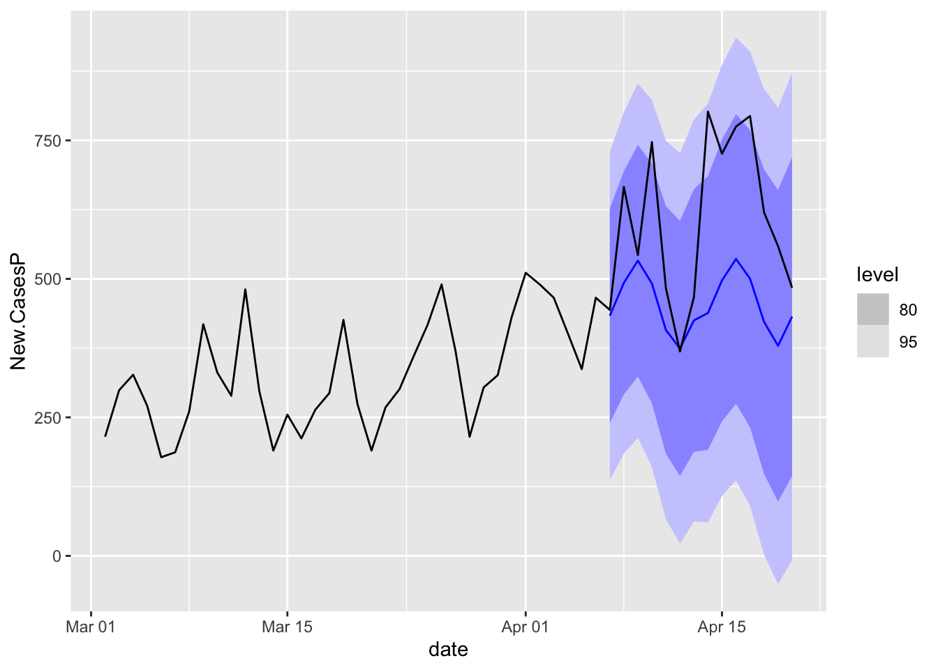
Prophet
library(prophet)
ProphMod <- prophet::prophet(NYT.COVID %>%
    filter(state == "Oregon") %>%
    select(ds = date, y = cases))
future <- make_future_dataframe(ProphMod, periods = 30)
forecast <- predict(ProphMod, future)
plot(ProphMod, forecast) + labs(x = "Date", y = "COVID-19 Cases", title = "COVID-19 Forecast for Oregon: Using Prophet")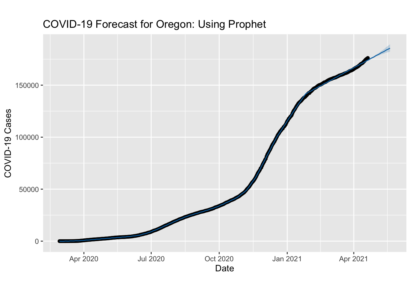
prophet_plot_components(ProphMod, forecast)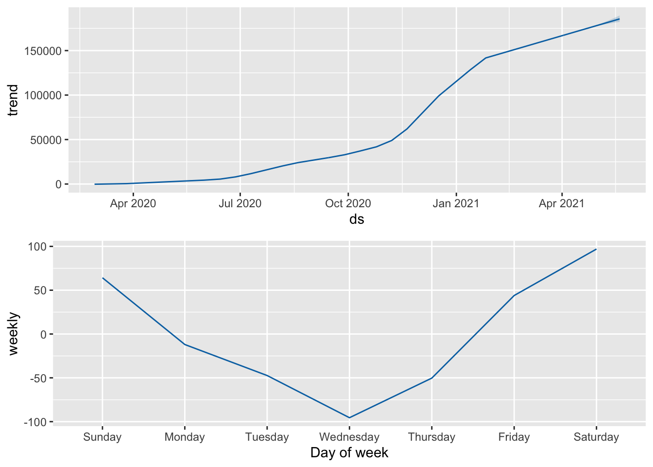
Oregon
Oregon.C19 <- NYTAgg.COVID %>%
    filter(state == "Oregon")
Oregon.C19 %>%
    features(cases, features = list(unitroot_kpss, unitroot_pp, unitroot_ndiffs,
        unitroot_nsdiffs))
# A tibble: 1 x 7
state kpss_stat kpss_pvalue pp_stat pp_pvalue ndiffs nsdiffs
<chr*> <dbl> <dbl> <dbl> <dbl> <int> <int>
1 Oregon 6.15 0.01 3.98 0.1 2 0Oregon.C19 %>%
features(deaths, features = list(unitroot_kpss, unitroot_pp, unitroot_ndiffs,
unitroot_nsdiffs))# A tibble: 1 x 7
state kpss_stat kpss_pvalue pp_stat pp_pvalue ndiffs nsdiffs
<chr*> <dbl> <dbl> <dbl> <dbl> <int> <int>
1 Oregon 6.05 0.01 3.39 0.1 2 0Oregon.C19 %<>%
mutate(New.Cases = difference(cases), New.Deaths = difference(deaths))# Visualize the differenced series
Oregon.C19 %>%
autoplot(New.Cases)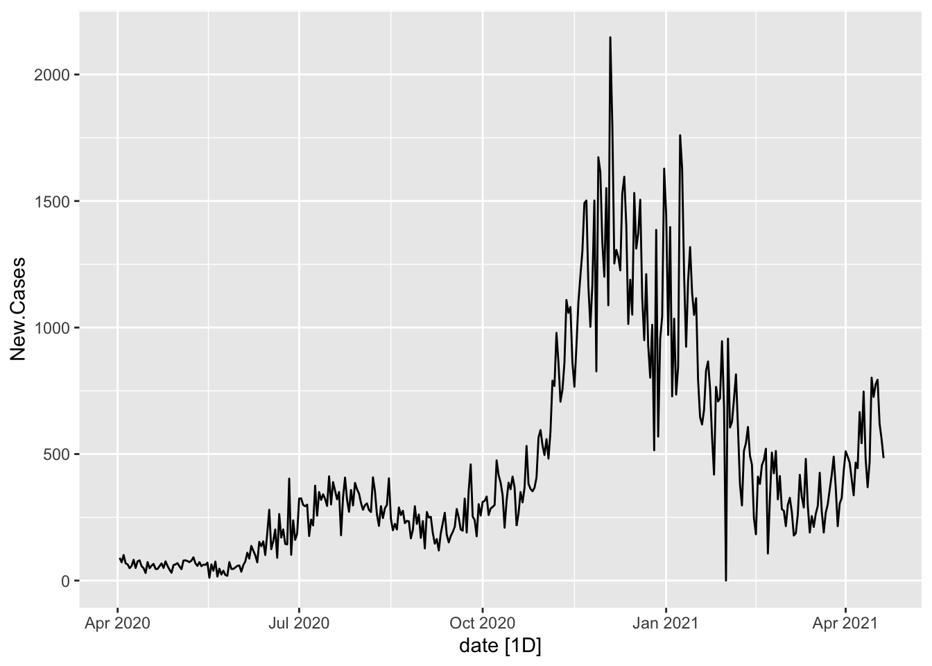
Oregon.C19 %>%
    autoplot(New.Deaths)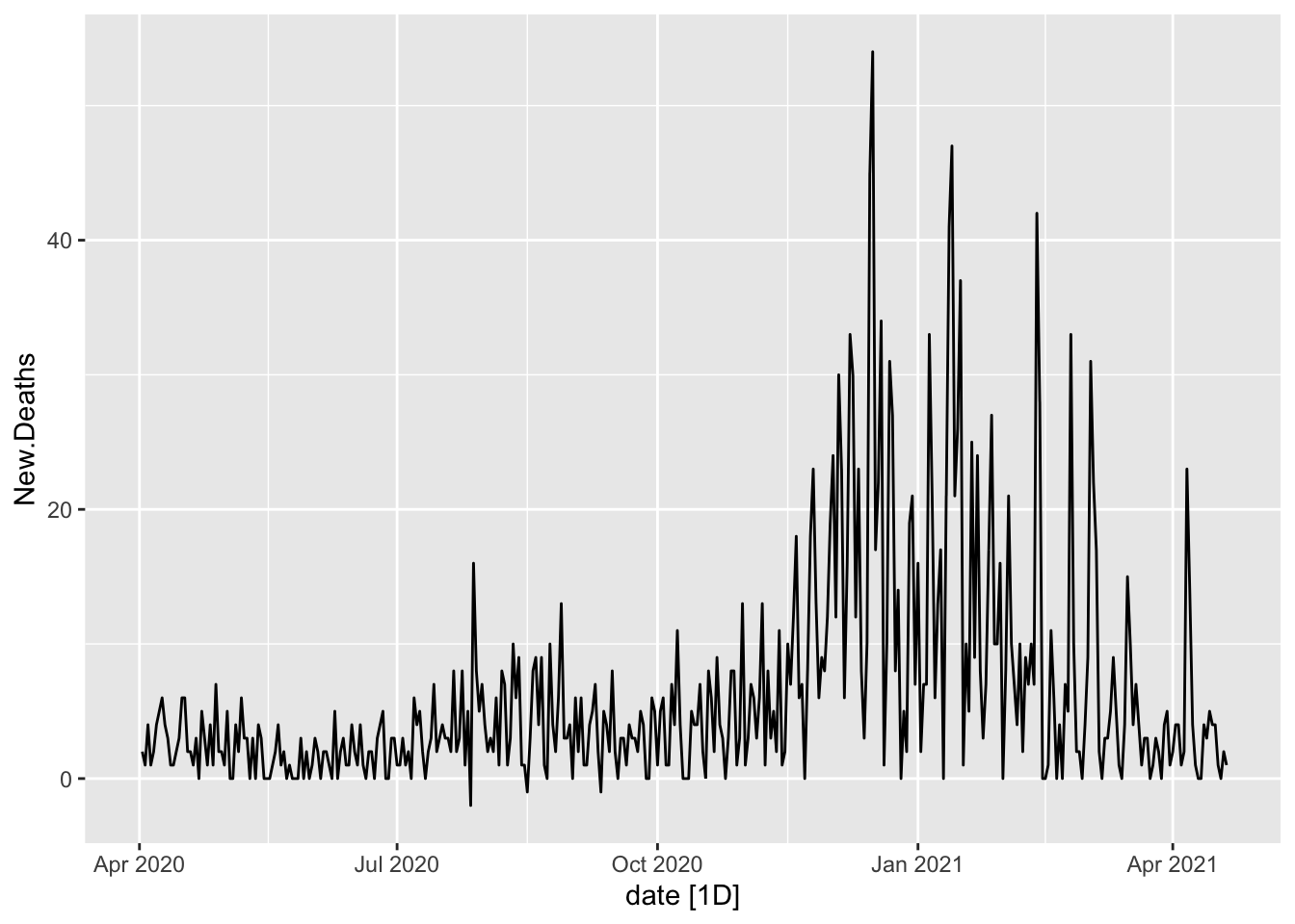
# The Features of the Differenced Series
Oregon.C19 %>%
    features(New.Cases, features = list(unitroot_kpss, unitroot_pp, unitroot_ndiffs,
        unitroot_nsdiffs))
# A tibble: 1 x 7
state kpss_stat kpss_pvalue pp_stat pp_pvalue ndiffs nsdiffs
<chr*> <dbl> <dbl> <dbl> <dbl> <int> <int>
1 Oregon 2.72 0.01 -3.46 0.01 1 0Oregon.C19 %>%
features(New.Deaths, features = list(unitroot_kpss, unitroot_pp, unitroot_ndiffs,
unitroot_nsdiffs))# A tibble: 1 x 7
state kpss_stat kpss_pvalue pp_stat pp_pvalue ndiffs nsdiffs
<chr*> <dbl> <dbl> <dbl> <dbl> <int> <int>
1 Oregon 2.12 0.01 -10.9 0.01 1 0Decompositions
# Classical decomposition
Oregon.C19 %>%
    filter(date > as.Date("2020-03-01")) %>%
    model(classical_decomposition(New.Cases, type = "additive")) %>%
    components() %>%
    autoplot()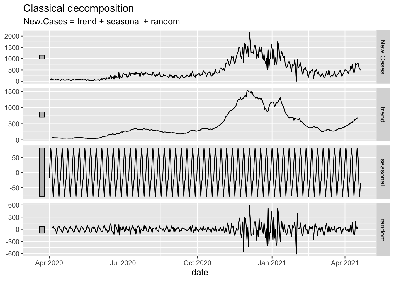
Oregon.C19 %>%
    filter(date > as.Date("2020-03-01")) %>%
    model(classical_decomposition(New.Cases, type = "multiplicative")) %>%
    components() %>%
    autoplot()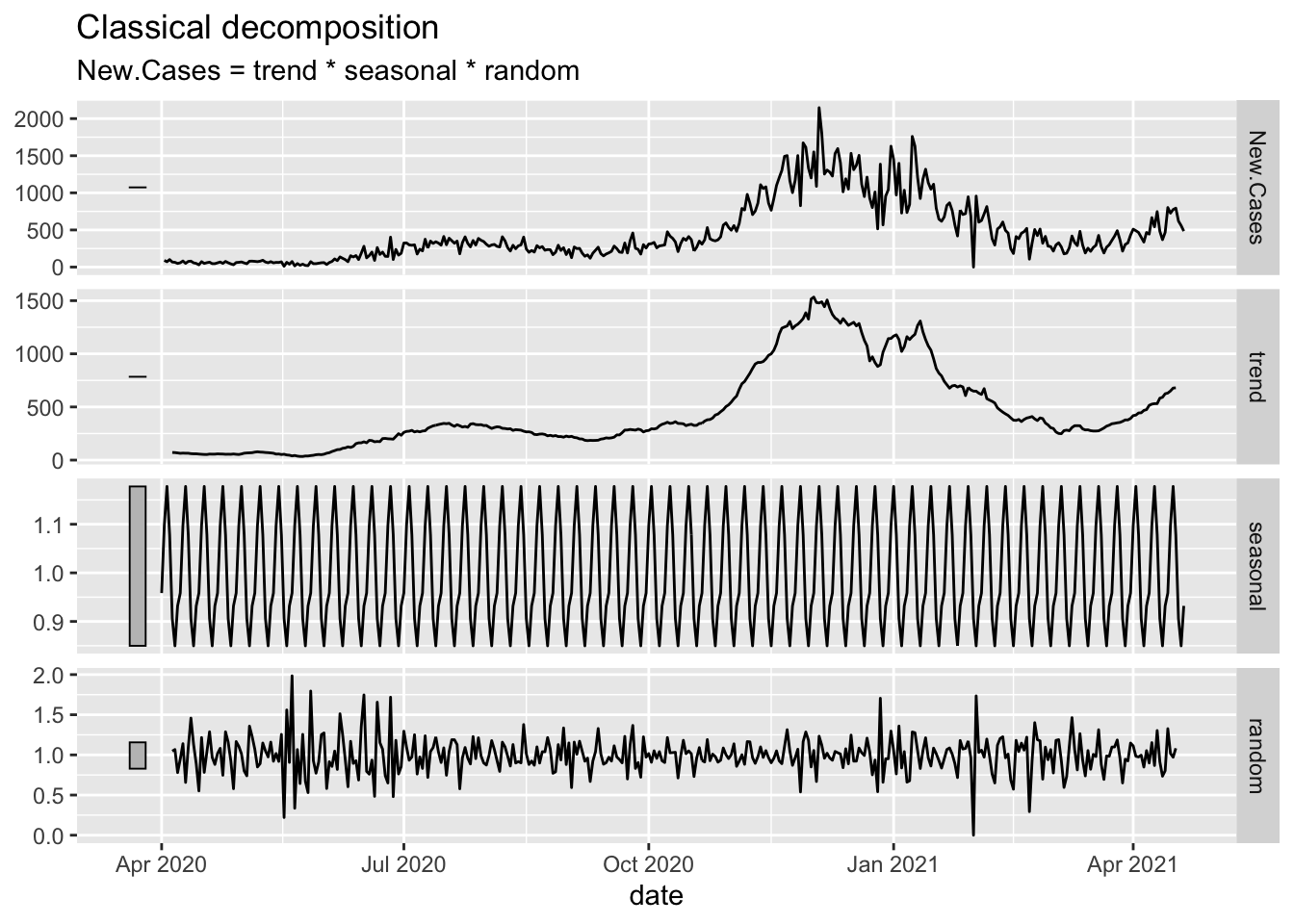
Cases
# Show the seasonally adjusted data
Oregon.C19 %>%
    filter(date > as.Date("2020-03-01")) %>%
    model(classical_decomposition(New.Cases, type = "additive")) %>%
    components() %>%
    select(season_adjust) %>%
    autoplot(season_adjust, alpha = 0.2) + geom_line(data = Oregon.C19, aes(x = date,
    y = New.Cases), color = "red", alpha = 0.2) + theme_ipsum_es() + labs(title = "Seasonally Adjusted (Add) New Covid-19 Cases",
    y = "New Covid-19 Cases")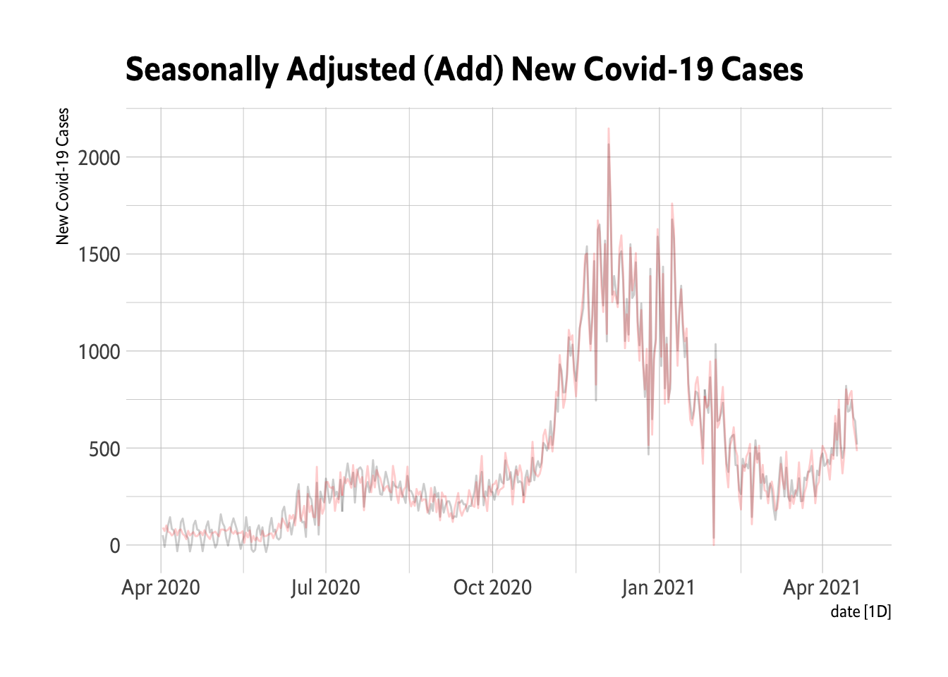
Deaths
Oregon.C19 %>%
    filter(date > as.Date("2020-03-01")) %>%
    model(classical_decomposition(New.Cases, type = "multiplicative")) %>%
    components() %>%
    select(season_adjust) %>%
    autoplot(season_adjust, alpha = 0.2) + geom_line(data = Oregon.C19, aes(x = date,
    y = New.Cases), color = "red", alpha = 0.2) + theme_ipsum_es() + labs(title = "Seasonally Adjusted (Mult) New Covid-19 Cases",
    y = "New Covid-19 Cases")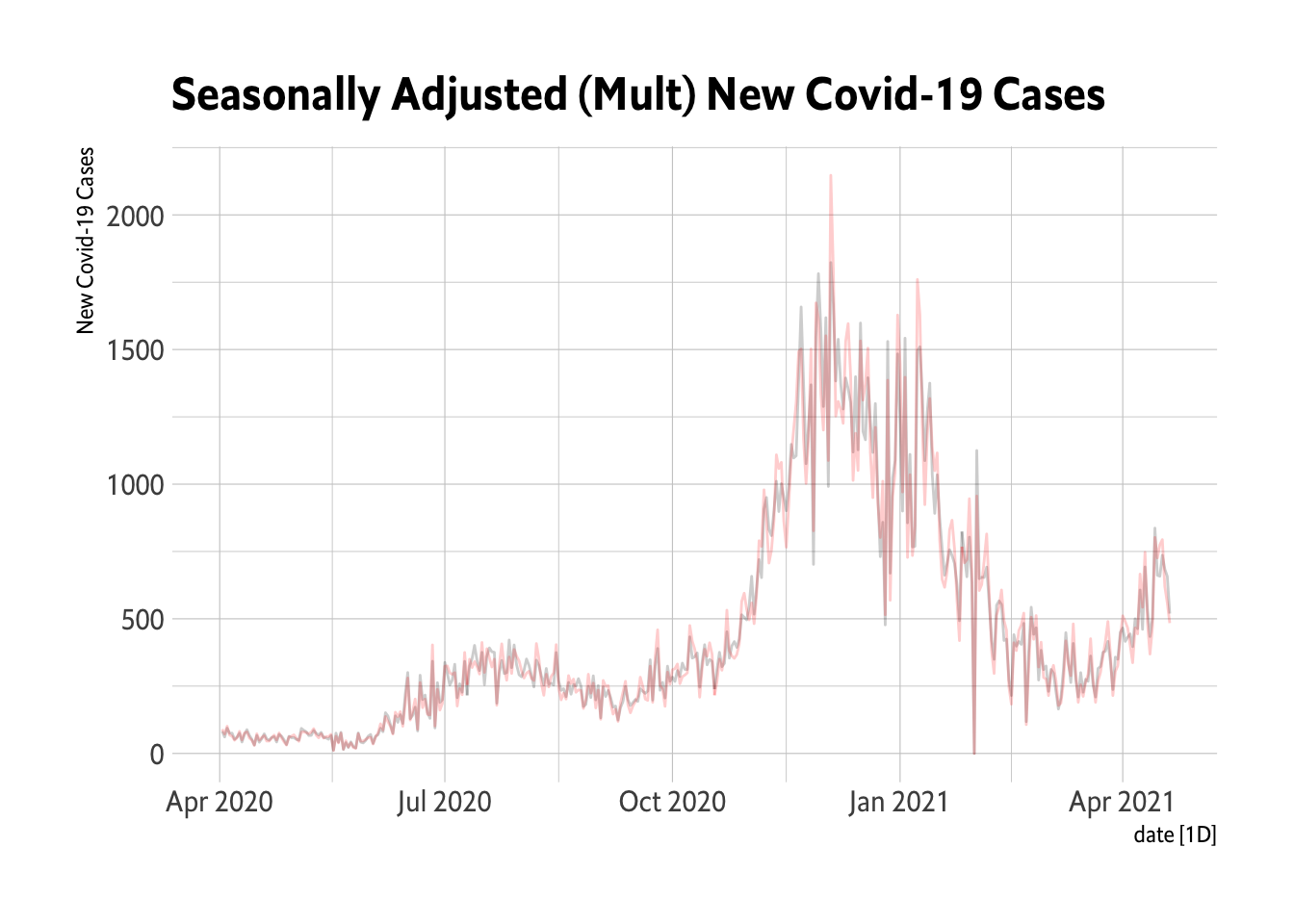
STL
The STL decomposition is a very useful tool.
Cases
# STL: Things are actually worse than the Fall....
Oregon.C19 %>%
    filter(date > as.Date("2020-04-01")) %>%
    model(STL(New.Cases ~ trend(window = 14) + season(period = "1 week"))) %>%
    components() %>%
    autoplot()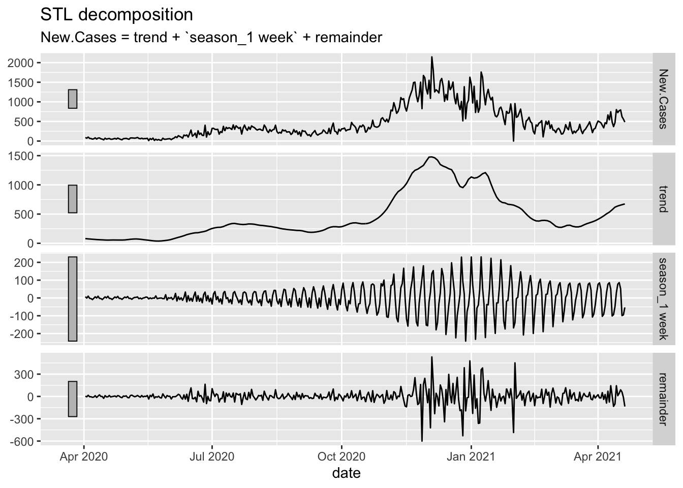
# The three peaks are interesting and we seem to be headed for a fourth that is
# already worse than the first.
Deaths
Oregon.C19 %>%
    filter(date > as.Date("2020-04-01")) %>%
    model(STL(New.Deaths ~ trend(window = 14) + season(period = "1 week"))) %>%
    components() %>%
    autoplot()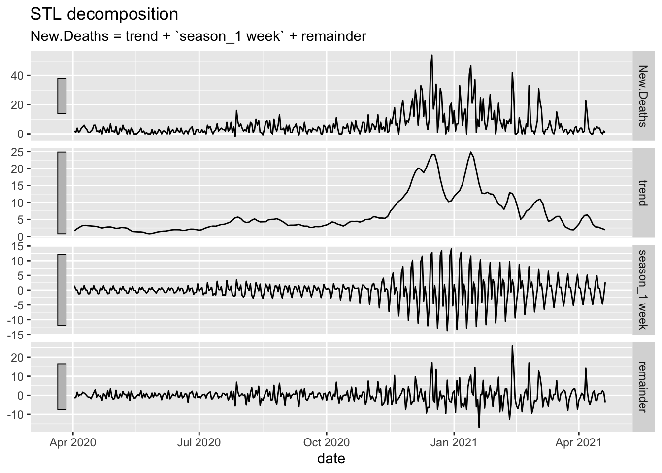
# Deaths are far more rare and the peaks are less noticeable.What follows works off of the data with the zeroes removed.
Some Models
OC19 <- Oregon.C19 %>%
    filter(date > as.Date("2020-04-01"))
fitC <- OC19 %>%
    filter(date > as.Date("2020-04-01")) %>%
    model(`K = 1` = ARIMA(New.CasesP ~ fourier(K = 1)), `K = 2` = ARIMA(New.CasesP ~
        fourier(K = 2)), `K = 3` = ARIMA(New.CasesP ~ fourier(K = 3)), ARIMA = ARIMA(New.CasesP),
        ETS = ETS(New.CasesP))
fitC %>%
    glance()
# A tibble: 5 x 12
state .model sigma2 log_lik AIC AICc BIC ar_roots ma_roots MSE
<chr*> <chr> <dbl> <dbl> <dbl> <dbl> <dbl> <list> <list> <dbl>
1 Oregon K = 1 22558. -2461. 4934. 4934. 4958. <cpl [0]> <cpl [15]> NA
2 Oregon K = 2 22511. -2460. 4935. 4935. 4967. <cpl [0]> <cpl [15]> NA
3 Oregon K = 3 22608. -2459. 4939. 4939. 4978. <cpl [0]> <cpl [15]> NA
4 Oregon ARIMA 24506. -2478. 4964. 4964. 4980. <cpl [0]> <cpl [15]> NA
5 Oregon ETS 22833. -3065. 6150. 6150. 6189. <NULL> <NULL> 22298.
# … with 2 more variables: AMSE <dbl>, MAE <dbl># The best fit is K=2
fitC %>%
select(`K = 2`) %>%
forecast() %>%
autoplot() + autolayer(Oregon.C19 %>%
select(New.CasesP) %>%
filter(date > as.Date("2021-02-01"))) + theme_ipsum_rc() + labs(title = "Harmonic Regression ARIMA Forecast of New COVID-19 Cases in Oregon") +
geom_point(aes(x = as.Date("2021-04-08"), y = 678), size = 5) + geom_label(data = data.frame(x = as.Date("2021-03-31"),
y = 736.446456504249, label = "Oregon's Case Count for 4/8/2021"), mapping = aes(x = x,
y = y, label = label), label.padding = unit(0.25, "lines"), label.r = unit(0.15,
"lines"), inherit.aes = FALSE)
Deaths
fitD <- OC19 %>%
    filter(date > as.Date("2020-04-01")) %>%
    model(`K = 1` = ARIMA(New.DeathsP ~ fourier(K = 1)), `K = 2` = ARIMA(New.DeathsP ~
        fourier(K = 2)), `K = 3` = ARIMA(New.DeathsP ~ fourier(K = 3)), ARIMA = ARIMA(New.DeathsP),
        ETS = ETS(New.DeathsP))
fitD %>%
    glance()
# A tibble: 5 x 12
state .model sigma2 log_lik AIC AICc BIC ar_roots ma_roots MSE
<chr*> <chr> <dbl> <dbl> <dbl> <dbl> <dbl> <list> <list> <dbl>
1 Oregon K = 1 34.8 -1222. 2457. 2458. 2485. <cpl [8]> <cpl [8]> NA
2 Oregon K = 2 34.4 -1218. 2454. 2455. 2490. <cpl [8]> <cpl [8]> NA
3 Oregon K = 3 34.5 -1218. 2457. 2458. 2501. <cpl [8]> <cpl [8]> NA
4 Oregon ARIMA 35.0 -1224. 2458. 2458. 2478. <cpl [8]> <cpl [8]> NA
5 Oregon ETS 38.3 -1838. 3695. 3696. 3735. <NULL> <NULL> 37.4
# … with 2 more variables: AMSE <dbl>, MAE <dbl>A Bigger Set of Models and Reconciliation
NC.Models <- COVID.Agg.Train %>%
    filter(date > as.Date("2020-04-01")) %>%
    model(`K = 1` = ARIMA(New.CasesP ~ fourier(K = 1)), `K = 2` = ARIMA(New.CasesP ~
        fourier(K = 2)), `K = 3` = ARIMA(New.CasesP ~ fourier(K = 3)), ARIMA = ARIMA(New.CasesP),
        ETS = ETS(New.CasesP), NNET = NNETAR(New.CasesP ~ fourier(K = 2, period = "1 week"))) %>%
    mutate(Combo1 = (`K = 2` + ARIMA + ETS)/3, Combo2 = (`K = 2` + ARIMA + ETS +
        NNET)/4) %>%
    reconcile(buARIMA = bottom_up(ARIMA), buK2 = bottom_up(`K = 2`), buETS = bottom_up(ETS),
        buNN = bottom_up(NNET))
Accuracy
FC.Cases <- NC.Models %>%
    forecast(h = 14)
FC.Cases %>%
accuracy(COVID.Agg.Test)# A tibble: 624 x 11
.model state .type ME RMSE MAE MPE MAPE MASE RMSSE
<chr> <chr*> <chr> <dbl> <dbl> <dbl> <dbl> <dbl> <dbl> <dbl>
1 ARIMA Alabama … Test 187. 457. 287. 12.5 60.3 NaN NaN
2 ARIMA Alaska … Test -44.5 107. 82.0 -Inf Inf NaN NaN
3 ARIMA Arizona … Test -23.9 227. 165. -13.4 26.0 NaN NaN
4 ARIMA Arkansas … Test 28.9 65.4 56.4 0.434 35.5 NaN NaN
5 ARIMA California … Test -318. 589. 540. -14.1 20.0 NaN NaN
6 ARIMA Colorado … Test 108. 557. 484. -4.91 32.6 NaN NaN
7 ARIMA Connecticut … Test -155. 396. 323. -Inf Inf NaN NaN
8 ARIMA Delaware … Test 12.7 48.0 42.5 0.506 13.6 NaN NaN
9 ARIMA District of Co… Test -9.02 39.2 32.9 -17.6 30.6 NaN NaN
10 ARIMA Florida … Test 408. 1630. 1170. -12.5 32.5 NaN NaN
# … with 614 more rows, and 1 more variable: ACF1 <dbl>Assess the models over the units.
FC.Cases %>%
accuracy(COVID.Agg.Test) %>%
group_by(state) %>%
slice_min(MAE) %>%
janitor::tabyl(.model) %>%
ggplot(aes(x = .model, y = n)) + geom_col() + theme_ipsum_rc()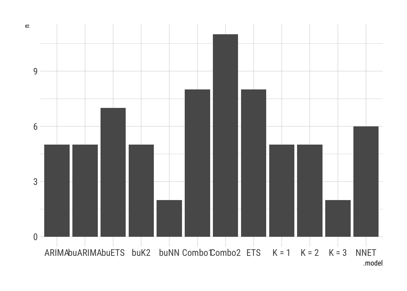
Deaths
ND.Models <- COVID.Agg.Train %>%
    filter(date > as.Date("2020-04-01")) %>%
    model(`K = 1` = ARIMA(New.DeathsP ~ fourier(K = 1)), `K = 2` = ARIMA(New.DeathsP ~
        fourier(K = 2)), `K = 3` = ARIMA(New.DeathsP ~ fourier(K = 3)), ARIMA = ARIMA(New.DeathsP),
        ETS = ETS(New.DeathsP), NNET = NNETAR(New.DeathsP ~ fourier(K = 2, period = "1 week"))) %>%
    mutate(Combo1 = (`K = 2` + ARIMA + ETS)/3, Combo2 = (`K = 2` + ARIMA + ETS +
        NNET)/4) %>%
    reconcile(buARIMA = bottom_up(ARIMA), buK2 = bottom_up(`K = 2`), buETS = bottom_up(ETS),
        buNN = bottom_up(NNET))
Accuracy
FC.Deaths <- ND.Models %>%
    forecast(h = 14)
FC.Deaths %>%
accuracy(COVID.Agg.Test)# A tibble: 624 x 11
.model state .type ME RMSE MAE MPE MAPE MASE RMSSE
<chr> <chr*> <chr> <dbl> <dbl> <dbl> <dbl> <dbl> <dbl> <dbl>
1 ARIMA Alabama … Test 0.750 13.8 12.3 NaN Inf NaN NaN
2 ARIMA Alaska … Test 1.33 5.54 2.24 -Inf Inf NaN NaN
3 ARIMA Arizona … Test 10.1 16.7 14.1 Inf Inf NaN NaN
4 ARIMA Arkansas … Test -4.83 5.69 4.83 -Inf Inf NaN NaN
5 ARIMA California … Test -3.25 36.2 27.9 -8.28 28.9 NaN NaN
6 ARIMA Colorado … Test 10.0 29.8 11.5 -Inf Inf NaN NaN
7 ARIMA Connecticut … Test 2.12 5.59 4.03 -Inf Inf NaN NaN
8 ARIMA Delaware … Test -1.13 2.23 1.72 -Inf Inf NaN NaN
9 ARIMA District of Col… Test -0.269 0.887 0.697 -Inf Inf NaN NaN
10 ARIMA Florida … Test -11.1 18.9 15.6 -69.3 74.6 NaN NaN
# … with 614 more rows, and 1 more variable: ACF1 <dbl>Assess the models over the units.
FC.Deaths %>%
accuracy(COVID.Agg.Test) %>%
group_by(state) %>%
slice_min(MAE) %>%
janitor::tabyl(.model) %>%
ggplot(aes(x = .model, y = n)) + geom_col() + theme_ipsum_rc()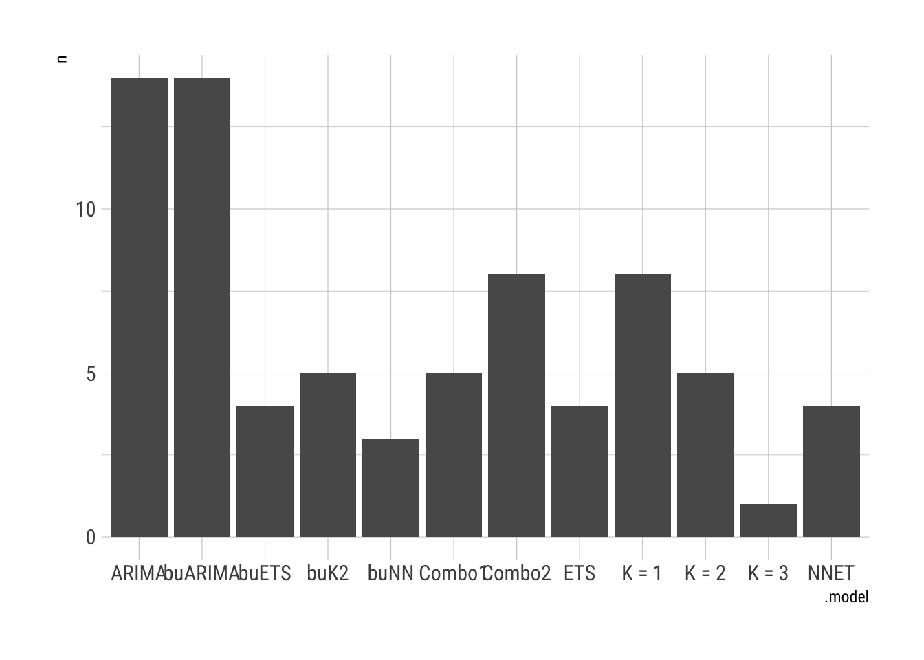
Robert W. Walker
Associate Professor of Quantitative Methods
My research interests include causal inference, statistical computation and data visualization.