NYT COVID-19 Aggregates
Analysis in logs
New York Times Data on COVID
I will grab the dataset from the NYT COVID data github. I will create two variables, New Cases and New Deaths to model. The final line use aggregation to create the national data.
NYT.COVIDN <- read.csv(url("https://raw.githubusercontent.com/nytimes/covid-19-data/master/us-states.csv"))
# Define a tsibble; the date is imported as character so mutate that first.
NYT.COVID <- NYT.COVIDN %>%
    mutate(date = as.Date(date)) %>%
    as_tsibble(index = date, key = state) %>%
    group_by(state) %>%
    mutate(New.Cases = difference(cases), New.Deaths = difference(deaths)) %>%
    filter(!(state %in% c("Guam", "Puerto Rico", "Virgin Islands", "Northern Mariana Islands")))
NYT.COVID <- NYT.COVID %>%
    mutate(New.CasesP = (New.Cases >= 0) * New.Cases, New.DeathsP = (New.Deaths >=
        0) * New.Deaths)
NYTAgg.COVID <- NYT.COVID %>%
    aggregate_key(state, New.CasesP = sum(New.CasesP, na.rm = TRUE), New.DeathsP = sum(New.DeathsP,
        na.rm = TRUE)) %>%
    filter(date > as.Date("2020-03-31")) %>%
    mutate(Day.of.Week = as.factor(wday(date, label = TRUE)))
A basic visual for verification. First the subseries.
library(patchwork)
plot1 <- NYTAgg.COVID %>%
    filter(!is_aggregated(state)) %>%
    autoplot(New.CasesP) + guides(color = FALSE)
plot2 <- NYTAgg.COVID %>%
    filter(!is_aggregated(state)) %>%
    autoplot(New.DeathsP) + guides(color = FALSE)
plot1/plot2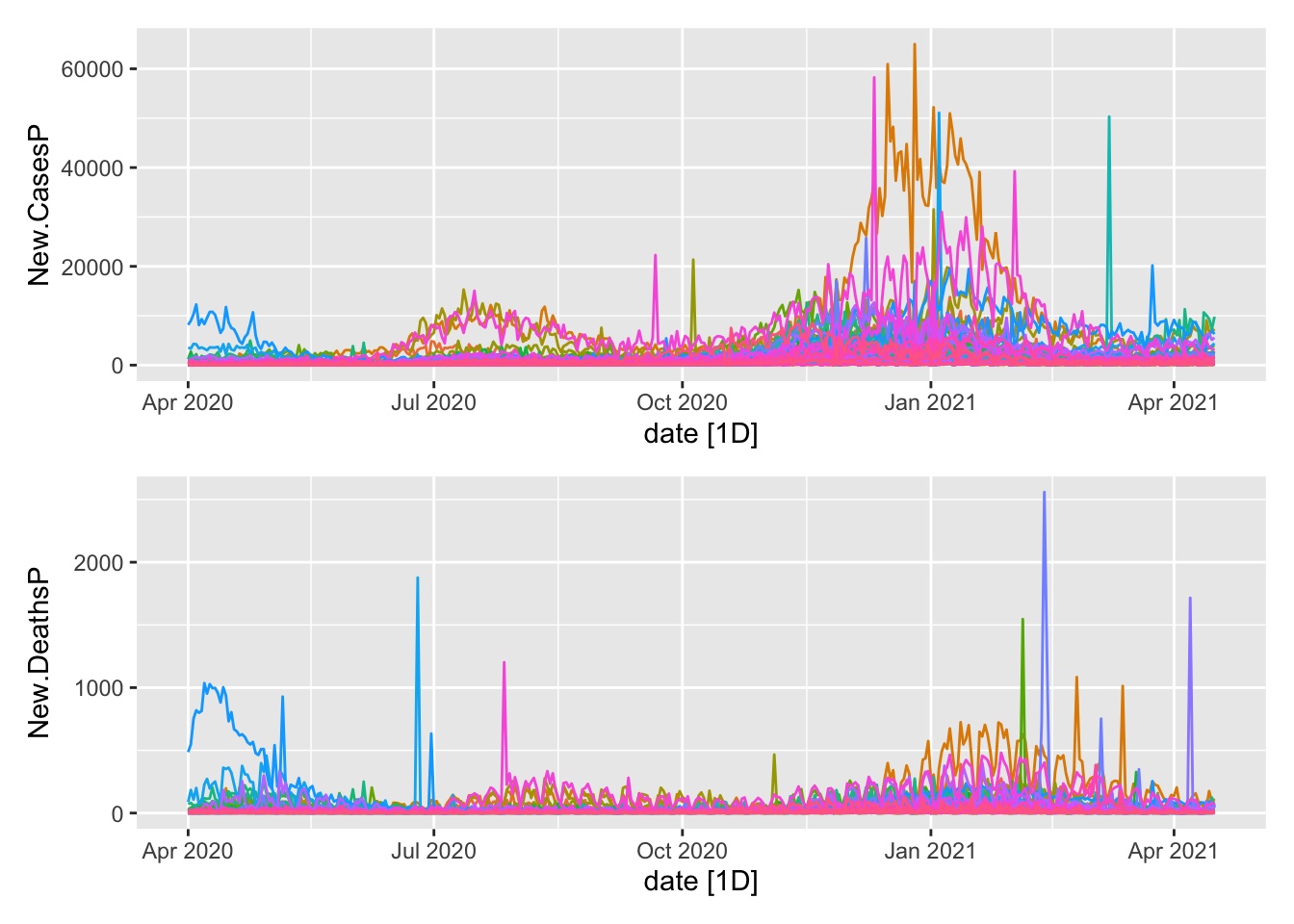
Now the aggregates.
plot1 <- NYTAgg.COVID %>%
    filter(is_aggregated(state)) %>%
    autoplot(New.CasesP)
plot2 <- NYTAgg.COVID %>%
    filter(is_aggregated(state)) %>%
    autoplot(New.DeathsP)
plot1/plot2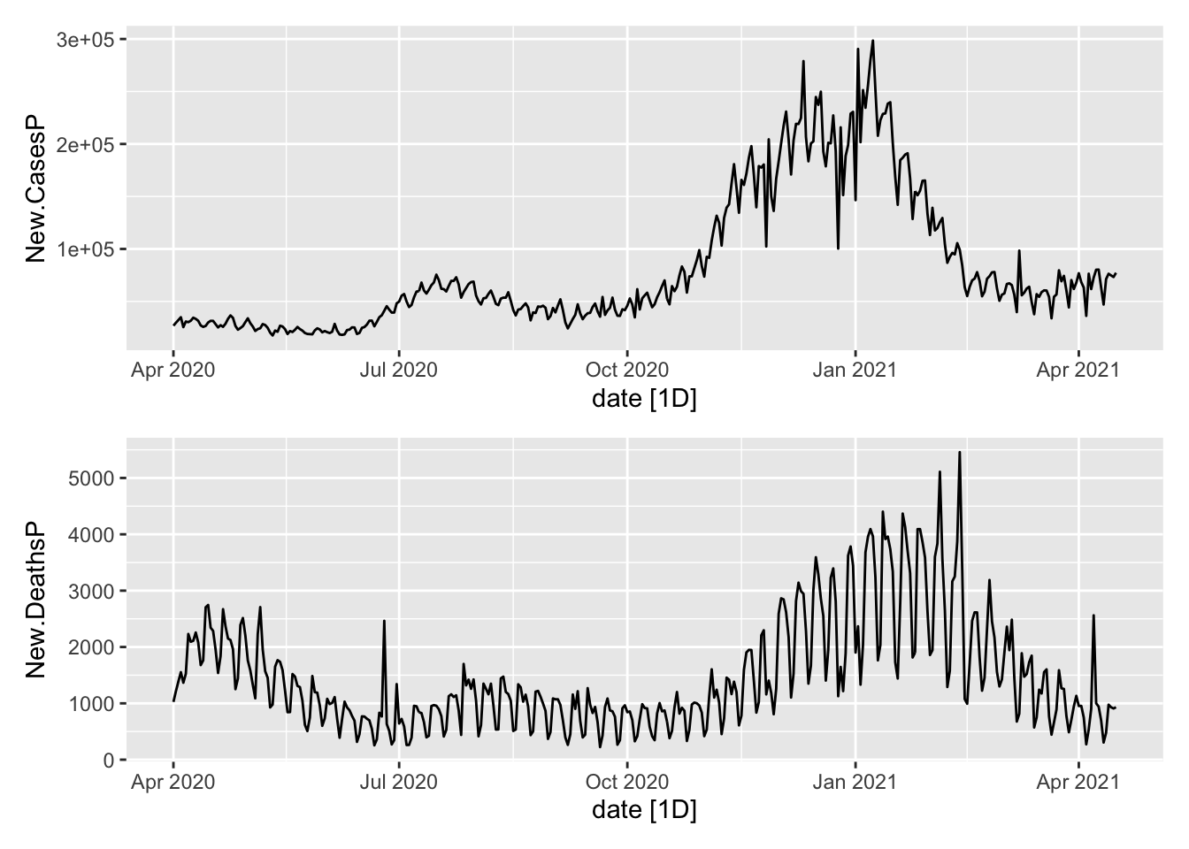
Are there day of week effects?
NYTAgg.COVID %>%
    model(TSLM(New.CasesP ~ Day.of.Week)) %>%
    glance() %>%
    filter(p_value < 0.05)
# A tibble: 12 x 16
state .model r_squared adj_r_squared sigma2 statistic p_value df
<chr*> <chr> <dbl> <dbl> <dbl> <dbl> <dbl> <int>
1 Arkansas … TSLM(Ne… 0.0450 0.0297 6.70e5 2.94 8.23e- 3 7
2 Connecticut… TSLM(Ne… 0.259 0.247 1.29e6 21.8 5.72e-22 7
3 District of… TSLM(Ne… 0.0401 0.0247 6.71e3 2.60 1.74e- 2 7
4 Hawaii … TSLM(Ne… 0.0688 0.0538 4.80e3 4.60 1.59e- 4 7
5 Idaho … TSLM(Ne… 0.0773 0.0625 2.10e5 5.22 3.55e- 5 7
6 Kansas … TSLM(Ne… 0.302 0.291 1.48e6 27.0 9.67e-27 7
7 Louisiana … TSLM(Ne… 0.143 0.129 1.38e6 10.4 1.12e-10 7
8 Michigan … TSLM(Ne… 0.0975 0.0830 6.84e6 6.73 8.74e- 7 7
9 Mississippi… TSLM(Ne… 0.0562 0.0411 4.29e5 3.71 1.34e- 3 7
10 Rhode Islan… TSLM(Ne… 0.213 0.201 2.84e5 16.9 2.72e-17 7
11 Texas … TSLM(Ne… 0.0332 0.0177 4.61e7 2.14 4.81e- 2 7
12 Washington … TSLM(Ne… 0.0665 0.0516 8.82e5 4.44 2.34e- 4 7
# … with 8 more variables: log_lik <dbl>, AIC <dbl>, AICc <dbl>, BIC <dbl>,
# CV <dbl>, deviance <dbl>, df.residual <int>, rank <int>In 12 states, there appear to be and in a few of them, those effects are large. Modelling this covariate seems useful. At the same time, this does nothing about the broad trends.
NYTAgg.COVID %>%
    model(TSLM(New.DeathsP ~ Day.of.Week)) %>%
    glance() %>%
    filter(p_value < 0.05)
# A tibble: 43 x 16
state .model r_squared adj_r_squared sigma2 statistic p_value df
<chr*> <chr> <dbl> <dbl> <dbl> <dbl> <dbl> <int>
1 Alabama TSLM(New… 0.129 0.115 1.80e3 9.22 1.99e- 9 7
2 Arizona TSLM(New… 0.164 0.150 3.00e3 12.2 1.50e-12 7
3 California TSLM(New… 0.0867 0.0721 2.63e4 5.92 6.40e- 6 7
4 Colorado TSLM(New… 0.0662 0.0512 4.35e2 4.42 2.49e- 4 7
5 Connecticut TSLM(New… 0.0905 0.0759 8.32e2 6.20 3.19e- 6 7
6 Delaware TSLM(New… 0.0408 0.0254 4.31e1 2.65 1.57e- 2 7
7 Florida TSLM(New… 0.127 0.113 3.10e3 9.06 2.96e- 9 7
8 Georgia TSLM(New… 0.163 0.149 2.04e3 12.1 1.94e-12 7
9 Idaho TSLM(New… 0.150 0.137 4.01e1 11.0 2.52e-11 7
10 Illinois TSLM(New… 0.0820 0.0672 2.71e3 5.56 1.53e- 5 7
# … with 33 more rows, and 8 more variables: log_lik <dbl>, AIC <dbl>,
# AICc <dbl>, BIC <dbl>, CV <dbl>, deviance <dbl>, df.residual <int>,
# rank <int>Training and Testing
That gives me the data that I want; now let me slice it up into training and test sets.
COVID.Agg.Test <- NYTAgg.COVID %>%
    as_tibble() %>%
    group_by(state) %>%
    slice_tail(n = 14) %>%
    ungroup() %>%
    as_tsibble(index = date, key = state)
COVID.Agg.Train <- anti_join(NYTAgg.COVID, COVID.Agg.Test) %>%
    as_tsibble(index = date, key = state)
Model Fitting
Fit some models to the data.
COVID.Models <- COVID.Agg.Train %>%
    model(`K = 2` = ARIMA(log(New.CasesP) ~ fourier(K = 2) + PDQ(0, 0, 0)), ARIMA = ARIMA(log(New.CasesP)),
        ETS = ETS(log(New.CasesP)), NNET = NNETAR(log(New.CasesP))) %>%
    mutate(Combo1 = (`K = 2` + ARIMA + ETS)/3, Combo2 = (`K = 2` + ARIMA + ETS +
        NNET)/4) %>%
    reconcile(buARIMA = bottom_up(ARIMA), buK2 = bottom_up(`K = 2`), buETS = bottom_up(ETS),
        buC2 = bottom_up(Combo2))
Forecast the models.
COVIDFC <- COVID.Models %>%
    forecast(h = 14, new_data = COVID.Agg.Test)
COVIDFC %>%
accuracy(COVID.Agg.Test)# A tibble: 520 x 11
.model state .type ME RMSE MAE MPE MAPE MASE RMSSE ACF1
<chr> <chr*> <chr> <dbl> <dbl> <dbl> <dbl> <dbl> <dbl> <dbl> <dbl>
1 ARIMA Alabama … Test NaN NaN NaN NaN NaN NaN NaN NA
2 ARIMA Alaska … Test NaN NaN NaN NaN NaN NaN NaN NA
3 ARIMA Arizona … Test NaN NaN NaN NaN NaN NaN NaN NA
4 ARIMA Arkansas … Test NaN NaN NaN NaN NaN NaN NaN NA
5 ARIMA California … Test 43.5 559. 442. -2.48 16.2 NaN NaN 0.343
6 ARIMA Colorado … Test -43.8 524. 451. -14.7 33.5 NaN NaN -0.292
7 ARIMA Connecticut … Test NaN NaN NaN NaN NaN NaN NaN NA
8 ARIMA Delaware … Test NaN NaN NaN NaN NaN NaN NaN NA
9 ARIMA District of C… Test NaN NaN NaN NaN NaN NaN NaN NA
10 ARIMA Florida … Test NaN NaN NaN NaN NaN NaN NaN NA
# … with 510 more rowsLook at the aggregates.
COVIDFC %>%
filter(is_aggregated(state)) %>%
autoplot(NYTAgg.COVID %>%
filter(date > as.Date("2021-03-01")), level = NULL)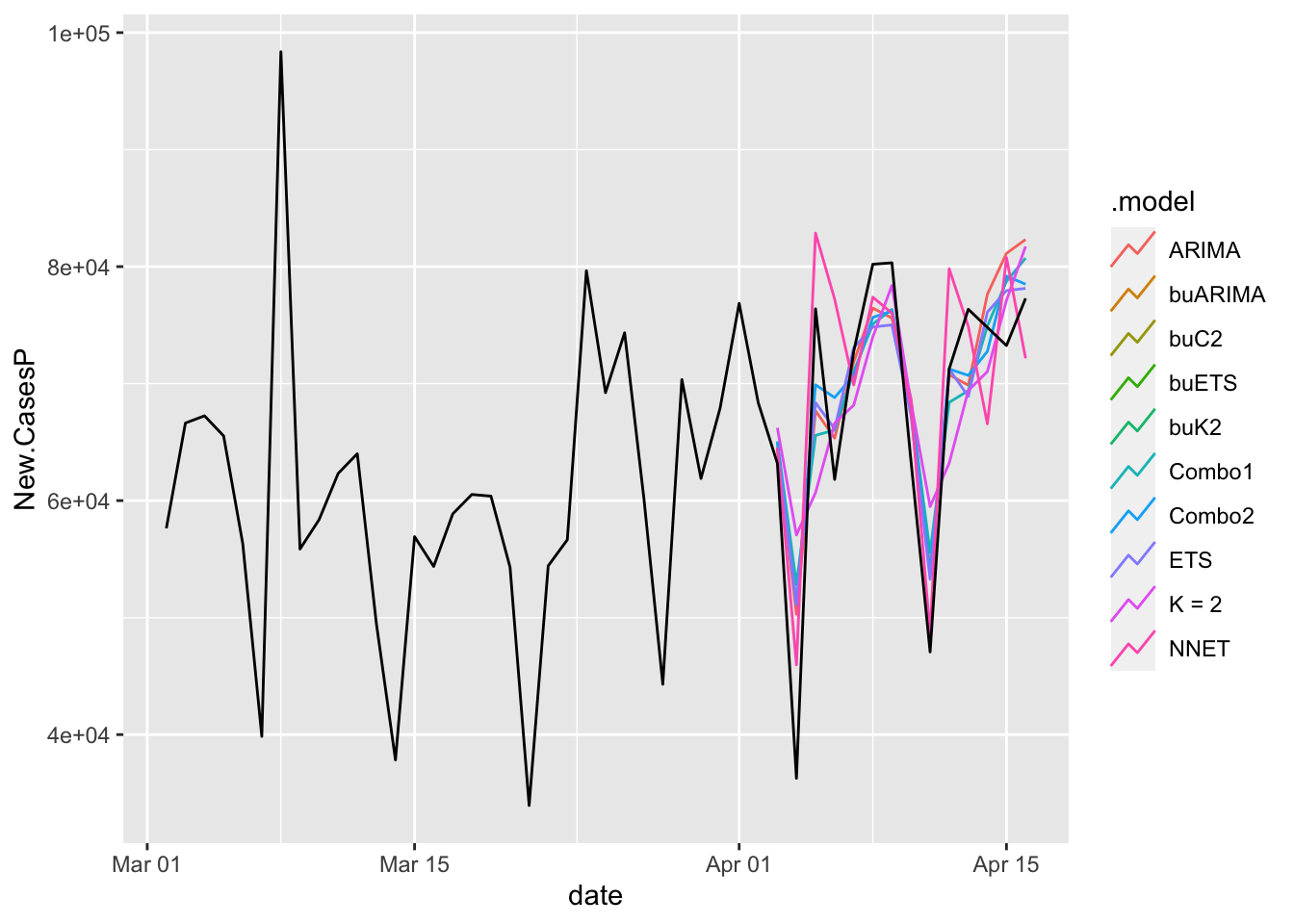
Assess the models over the units.
COVIDFC %>%
accuracy(COVID.Agg.Test) %>%
group_by(state) %>%
slice_min(MAE) %>%
janitor::tabyl(.model) %>%
ggplot(aes(x = .model, y = n)) + geom_col() + theme_ipsum_rc()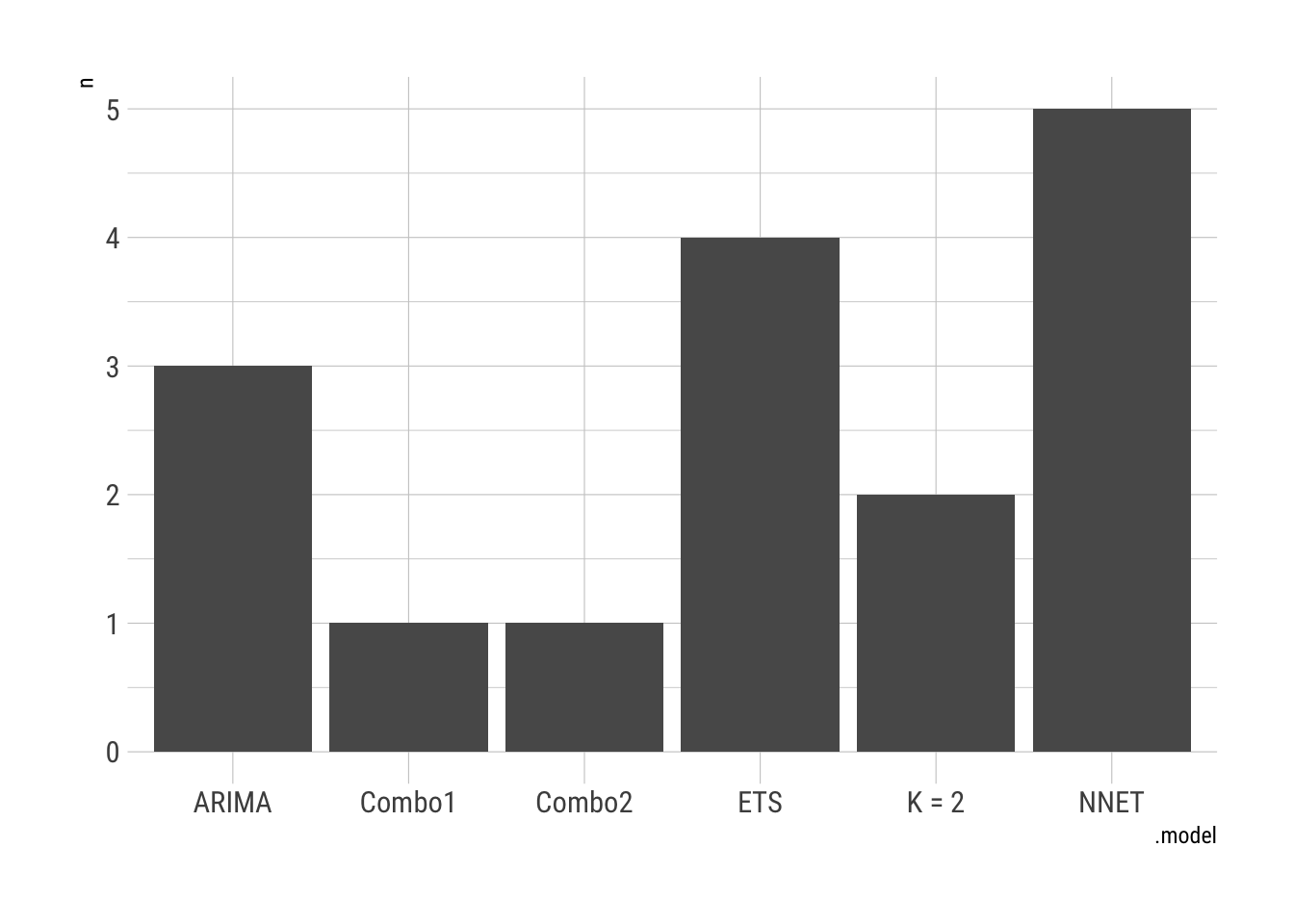
save.image("logAggFC.RData")Robert W. Walker
Associate Professor of Quantitative Methods
My research interests include causal inference, statistical computation and data visualization.