Sliding Windows with Slider
Data
I will use the data from the New York Times on COVID. I want to illustrate the use of slider for the creation of moving averages on tsibble structures. To render some context for the data, let me import it, transform it a bit to make it more sensible [removing negative values], and turn it into a tsibble.
library(tidyverse); library(fpp3); library(hrbrthemes)
NYT.COVIDN <- read.csv(url("https://raw.githubusercontent.com/nytimes/covid-19-data/master/us-states.csv"))
# Define a tsibble; the date is imported as character so mutate that first.
NYT.COVID <- NYT.COVIDN %>%
  mutate(date=as.Date(date)) %>%
  as_tsibble(index=date, key=state) %>%
  group_by(state) %>%
  mutate(New.Cases = difference(cases), New.Deaths = difference(deaths)) %>%
  filter(!(state %in% c("Guam","Puerto Rico", "Virgin Islands","Northern Mariana Islands")))
NYT.COVID <- NYT.COVID %>%
  mutate(
    New.Cases = (New.Cases >= 0)*New.Cases,
    New.Deaths = (New.Deaths >= 0)*New.Deaths,
    cases = cases,
    deaths = deaths)
NYTAgg.COVID <- NYT.COVID %>%
  aggregate_key(state,
                cases = sum(cases, na.rm=TRUE),
                deaths = sum(deaths, na.rm=TRUE),
                New.Cases = sum(New.Cases, na.rm=TRUE),
                New.Deaths = sum(New.Deaths, na.rm=TRUE)) %>%
  filter(date > as.Date("2020-03-31")) %>%
  mutate(Day.of.Week = as.factor(wday(date, label = TRUE)))
The aggregate_key generates national sums as a result of each individual unit. This can be very handy in bottom up forecasting. I will focus on the aggregates.
Forecasting the US
I want to focus on the US data.
A Basic Plot
Let me start with a plot of New.Cases.
library(hrbrthemes)
options(scipen=6)
NYTAgg.COVID %>% filter(is_aggregated(state)) %>% autoplot(New.Cases) + theme_ipsum_rc() + labs(title="New COVID-19 Cases in the US")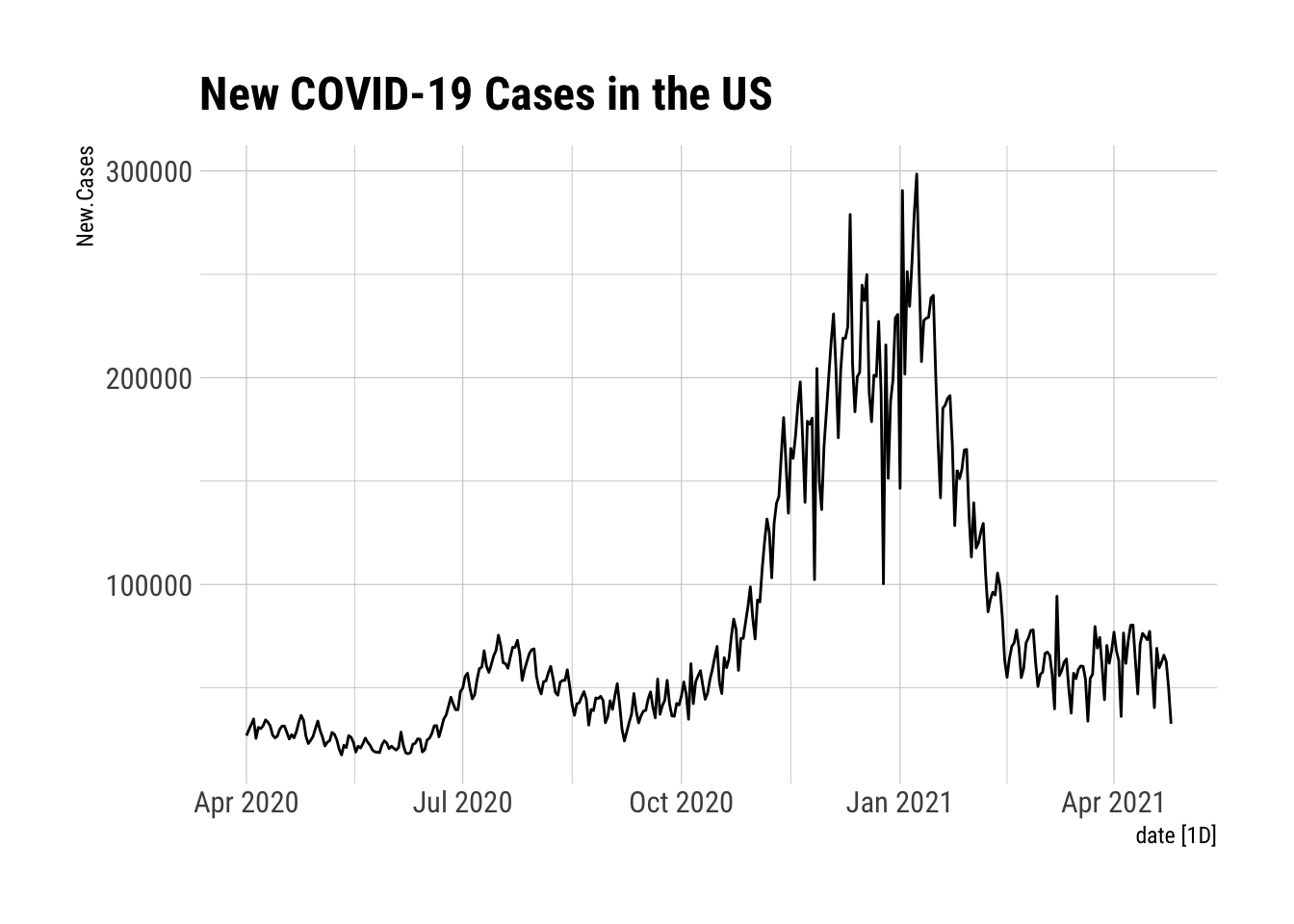
Some Summary Information
NYTAgg.COVID %>% filter(is_aggregated(state)) %>% features(New.Cases, list(mean, sd, quantile))## # A tibble: 1 x 8
## state ...1 ...2 `0%` `25%` `50%` `75%` `100%`
## <chr*> <dbl> <dbl> <dbl> <dbl> <dbl> <dbl> <dbl>
## 1 <aggregated> 81430. 64544. 17560 36418 58310. 98183 298487NYTAgg.COVID %>% filter(is_aggregated(state)) %>% features(New.Deaths, list(mean, sd, quantile))## # A tibble: 1 x 8
## state ...1 ...2 `0%` `25%` `50%` `75%` `100%`
## <chr*> <dbl> <dbl> <dbl> <dbl> <dbl> <dbl> <dbl>
## 1 <aggregated> 1453. 978. 224 789 1158 1889. 5458STL Characteristics
NYTAgg.COVID %>% filter(is_aggregated(state)) %>% features(New.Deaths, feat_stl)## # A tibble: 1 x 10
## state trend_strength seasonal_strengt… seasonal_peak_w… seasonal_trough…
## <chr*> <dbl> <dbl> <dbl> <dbl>
## 1 <aggregate… 0.918 0.799 1 5
## # … with 5 more variables: spikiness <dbl>, linearity <dbl>, curvature <dbl>,
## # stl_e_acf1 <dbl>, stl_e_acf10 <dbl>NYTAgg.COVID %>% filter(is_aggregated(state)) %>% model(STL(New.Cases)) %>% components() %>% autoplot()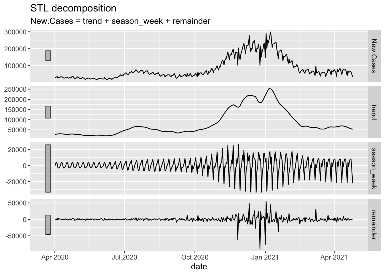
Moving Averages using slider::
The slider packages makes this very straightforward. The mutate line contains all the action. If I want the moving average (mean) of 3 .before, 3 .after, and the current datum with a complete set, the following code defining 7-MA will suffice. 7-TA defines a mean from the current and six prior observations.
NYTAG <- NYTAgg.COVID %>%
  filter(is_aggregated(state)) %>%
  mutate(`7-MA` = slider::slide_dbl(New.Cases, mean, .before=3, .after=3, .complete=TRUE)) %>%
  mutate(`7-TA` = slider::slide_dbl(New.Cases, mean, .before=6, .after=0, .complete=TRUE))
NYTAG %>%
  autoplot(`7-MA`, color="red", alpha=0.2) +
  autolayer(NYTAG %>% select(`7-TA`), color="blue", alpha=0.2) +
  autolayer(NYTAgg.COVID %>%
              filter(is_aggregated(state)) %>%
              select(New.Cases), alpha=0.2) +
  labs(y="New COVID-19 Cases", title="New COVID-19 Cases in the US", subtitle="7 day moving average in red") + theme_ipsum_rc()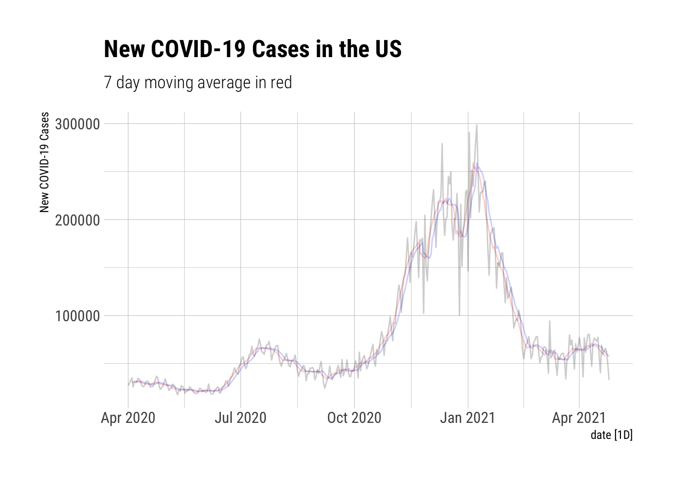
Deaths: Moving Averages using slider::
Now I want a 14 day trailing average. That’s 13 before and 0 after. What do new COVID-19 deaths in the US look like when measured in that way?
NYTAgg.COVID %>%
filter(is_aggregated(state)) %>%
mutate(`14-TA` = slider::slide_dbl(New.Deaths, mean, .before=13, .after=0, .complete=TRUE)) %>%
autoplot(`14-TA`, color="red") +
autolayer(NYTAgg.COVID %>%
filter(is_aggregated(state)) %>%
select(New.Deaths), alpha=0.2) +
labs(y="New COVID-19 Deaths", title="New COVID-19 Deaths in the US", subtitle="14 day trailing average in red") + theme_ipsum_rc()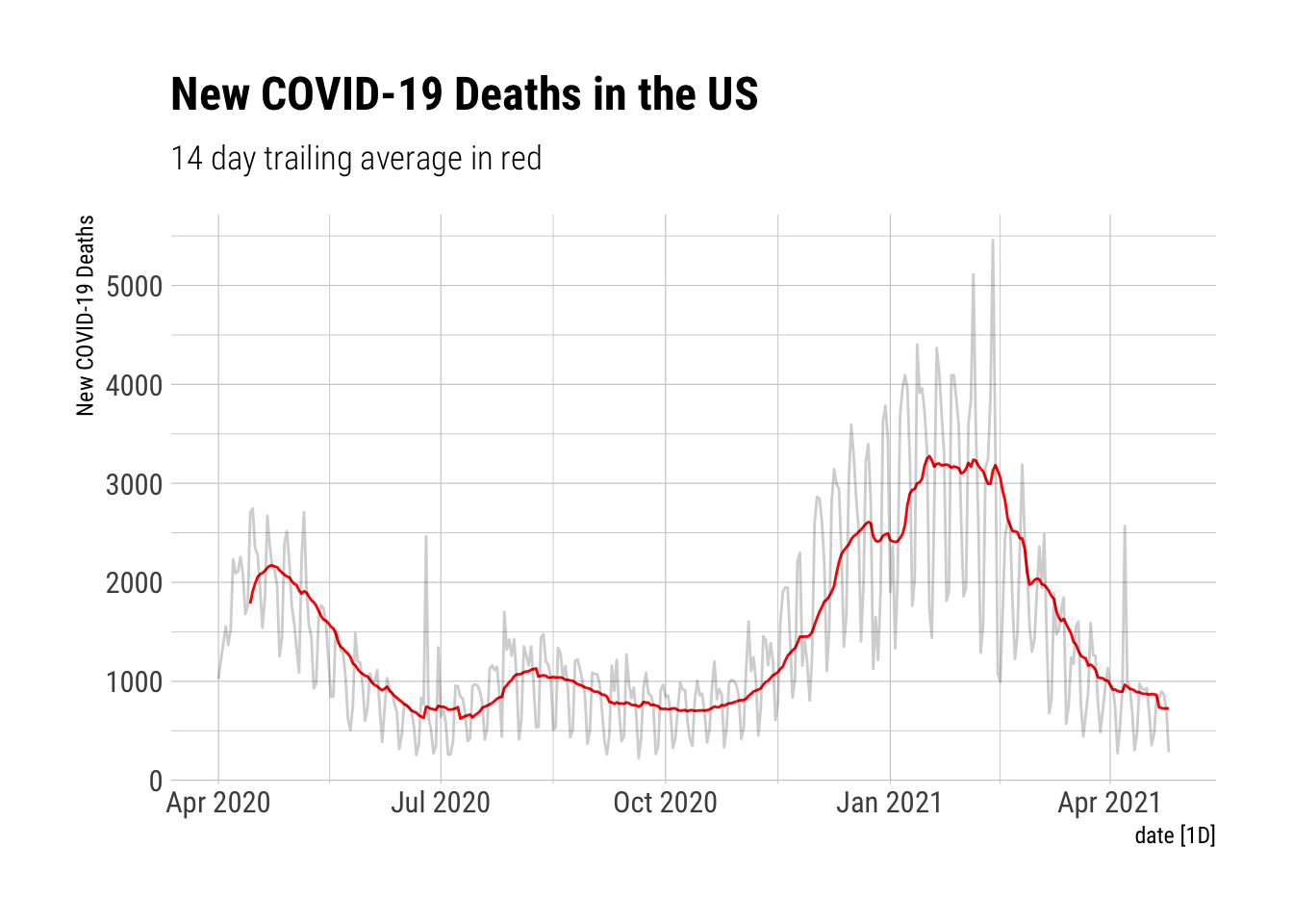 # A Better Plot
My personal favorite plot.
NYTAG %>%
  autoplot(`7-TA`, color="blue") +
  geom_point(aes(x=date, y=New.Cases), alpha=0.2, color="red") + labs(title="New COVID-19 Cases in the US", subtitle="7 Day trailing average in blue", y="New COVID-19 Cases")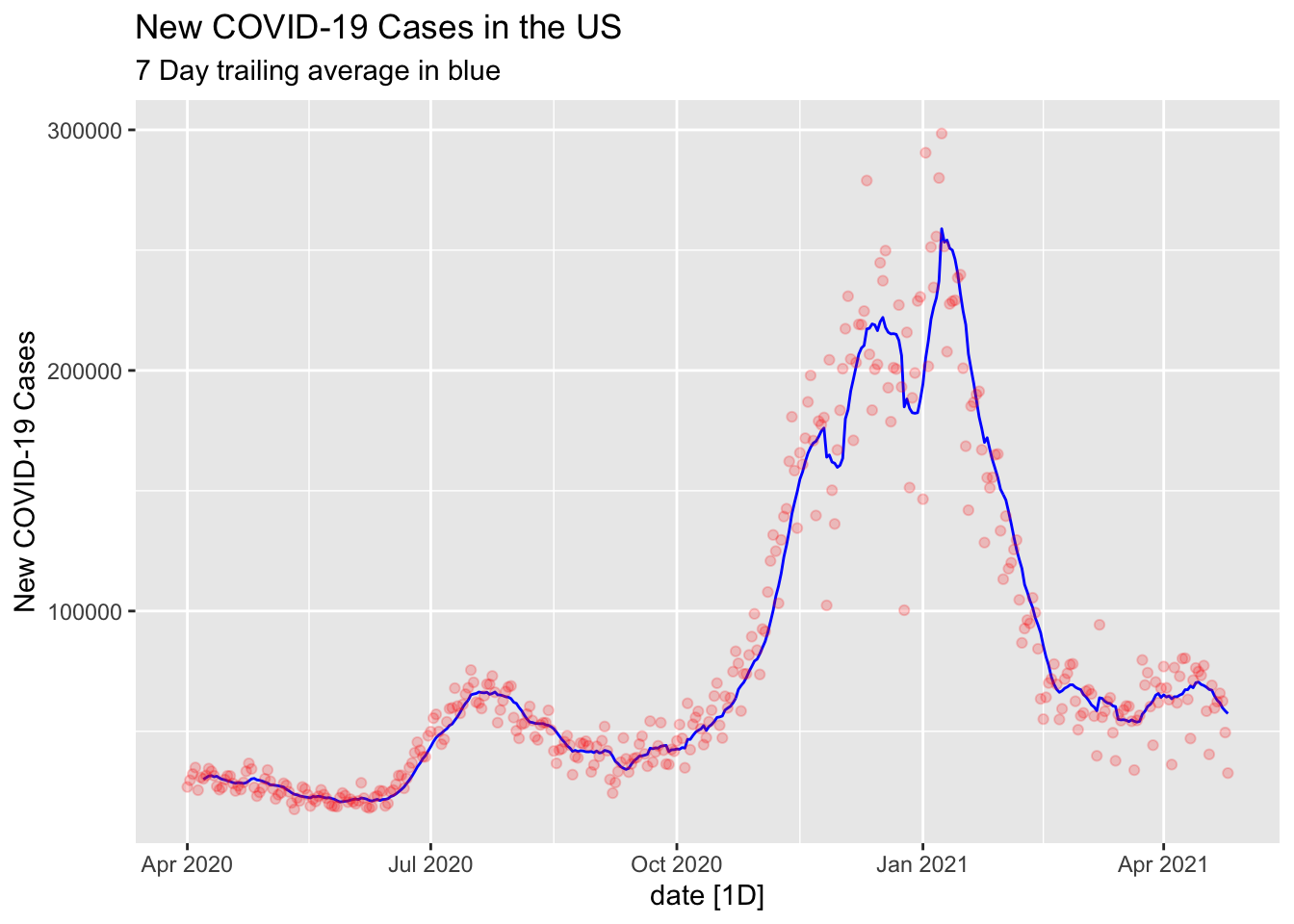
Robert W. Walker
Associate Professor of Quantitative Methods
My research interests include causal inference, statistical computation and data visualization.