Visualizing One Qualitative and One Quantitative Variable
Bonds
A dataset for illustrating the various available visualizations needs a certain degree of richness with manageable size. The dataset on Bonds contains three categorical and a few quantitative indicators sufficient to show what we might wish.
Loading the Data
Bonds <- read.csv(url("https://raw.githubusercontent.com/robertwwalker/DADMStuff/master/BondFunds.csv"))A Summary
library(skimr)
Bonds %>%
skim()| Name | Piped data |
| Number of rows | 184 |
| Number of columns | 9 |
| _______________________ | |
| Column type frequency: | |
| character | 4 |
| numeric | 5 |
| ________________________ | |
| Group variables | None |
Variable type: character
| skim_variable | n_missing | complete_rate | min | max | empty | n_unique | whitespace |
|---|---|---|---|---|---|---|---|
| Fund.Number | 0 | 1 | 4 | 6 | 0 | 184 | 0 |
| Type | 0 | 1 | 20 | 23 | 0 | 2 | 0 |
| Fees | 0 | 1 | 2 | 3 | 0 | 2 | 0 |
| Risk | 0 | 1 | 7 | 13 | 0 | 3 | 0 |
Variable type: numeric
| skim_variable | n_missing | complete_rate | mean | sd | p0 | p25 | p50 | p75 | p100 | hist |
|---|---|---|---|---|---|---|---|---|---|---|
| Assets | 0 | 1 | 910.65 | 2253.27 | 12.40 | 113.72 | 268.4 | 621.95 | 18603.50 | ▇▁▁▁▁ |
| Expense.Ratio | 0 | 1 | 0.71 | 0.26 | 0.12 | 0.53 | 0.7 | 0.90 | 1.94 | ▂▇▅▁▁ |
| Return.2009 | 0 | 1 | 7.16 | 6.09 | -8.80 | 3.48 | 6.4 | 10.72 | 32.00 | ▁▇▅▁▁ |
| X3.Year.Return | 0 | 1 | 4.66 | 2.52 | -13.80 | 4.05 | 5.1 | 6.10 | 9.40 | ▁▁▁▅▇ |
| X5.Year.Return | 0 | 1 | 3.99 | 1.49 | -7.30 | 3.60 | 4.3 | 4.90 | 6.80 | ▁▁▁▅▇ |
Most data types are represented. There is no time variable so dates and the visualizations that go with time series are omitted.
Data Visualization
There are three primary visualizations that we might use for the combination of one qualitative and one quantitative indicator. I will deploy boxplots, violin plots, overlaid densities, and dotplots.
geom_boxplot()
This will construct a boxplot of quantitative y for each value of the qualitative variable placed on x. This is very hard to read because of the extrema.
Bonds %>%
    ggplot(., aes(x = Risk, y = Assets)) + geom_boxplot()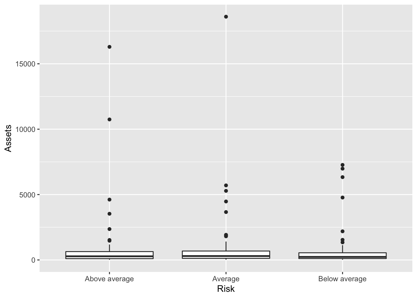
geom_dotplot()
The number of bins, the axis they are placed on, and the size of the dots are core to dotplots. It is often simply a matter of trial and error.
Bonds %>%
    ggplot(., aes(x = Risk, y = Assets, color = Risk)) + geom_dotplot(binaxis = "y",
    bins = 50, dotsize = 0.3)
## Warning: Ignoring unknown parameters: bins## Bin width defaults to 1/30 of the range of the data. Pick better value with `binwidth`.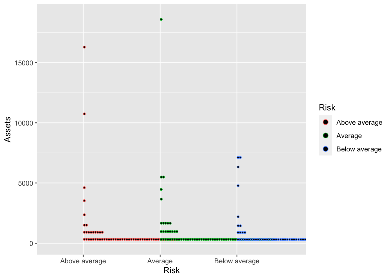
Improved
Bonds %>%
    ggplot(., aes(x = Risk, y = Assets, color = Risk)) + geom_dotplot(binaxis = "y",
    bins = 50, dotsize = 0.3) + guides(color = FALSE) + theme_minimal()
## Warning: Ignoring unknown parameters: bins## Warning: `guides(<scale> = FALSE)` is deprecated. Please use `guides(<scale> =
## "none")` instead.## Bin width defaults to 1/30 of the range of the data. Pick better value with `binwidth`.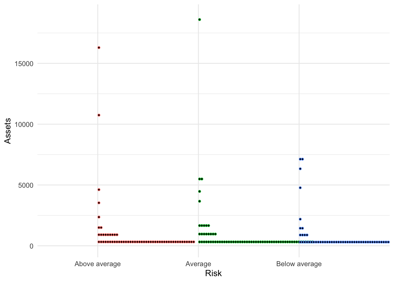
geom_violin()
The most basic violin plot shows a two-sided density plot for each value of x. By default, all violins have the same area.
Bonds %>%
ggplot(., aes(x = Risk, y = Assets)) + geom_violin()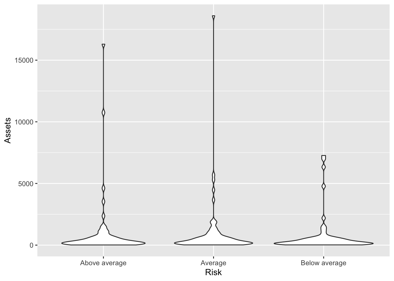 ### Adjusting the area:
 scale=count
We can adjust the violins to have area proportional to the count of observations by deploying the scale argument set equal to count.
Bonds %>%
    ggplot(., aes(x = Risk, y = Assets)) + geom_violin(scale = "count")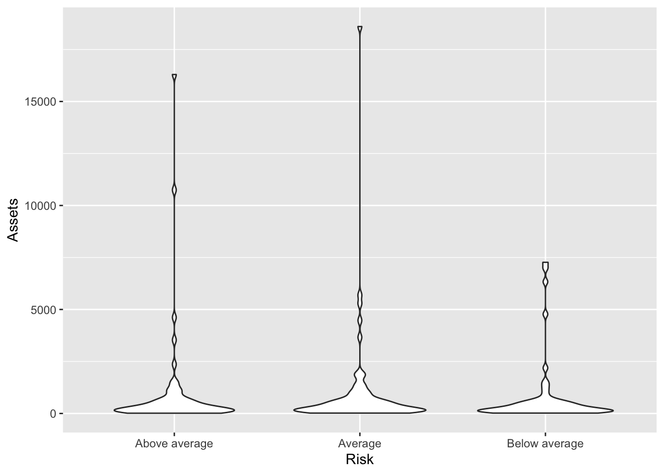
Adjusting the area: scale=width
We can also adjust the violins to have equal width.
Bonds %>%
    ggplot(., aes(x = Risk, y = Assets)) + geom_violin(scale = "width")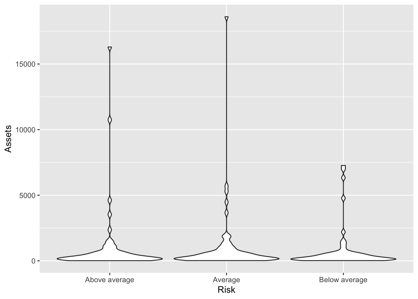
Adjusting the bandwidth
We can also make the violins smoother or more rigid with the adjust= argument. Numbers greater than one make it smoother.
Bonds %>%
    ggplot(., aes(x = Risk, y = Assets)) + geom_violin(scale = "count", adjust = 2)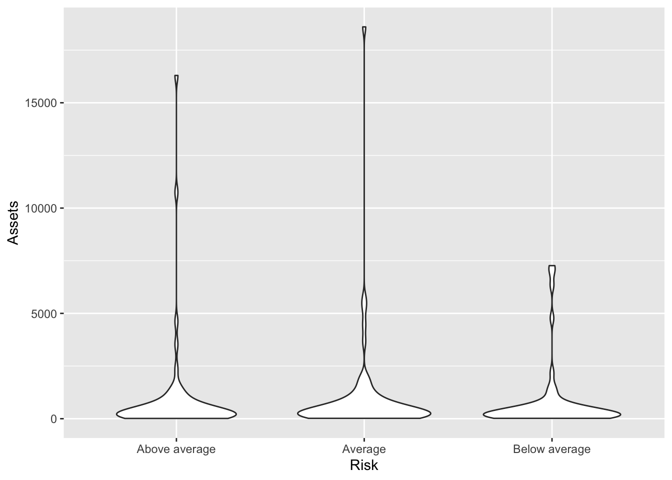
Numbers less than one make it less smooth.
Bonds %>%
    ggplot(., aes(x = Risk, y = Assets)) + geom_violin(scale = "count", adjust = 1/2)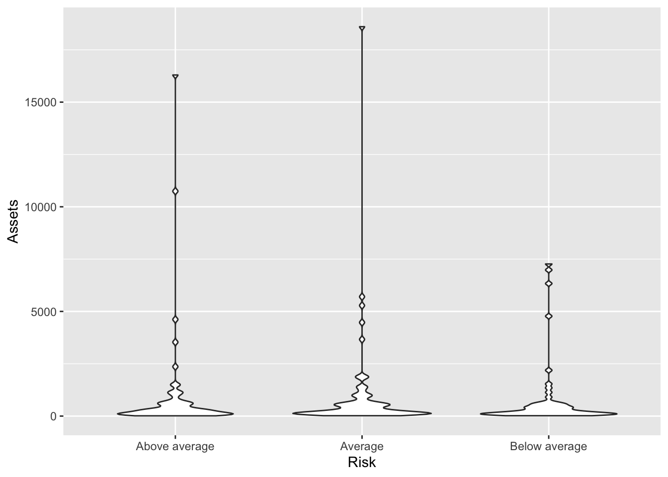
geom_density() with color/fill
We can color the lines of a density plot to try and showcase the various distributions.
Bonds %>%
ggplot(., aes(x = Assets, color = Risk)) + geom_density()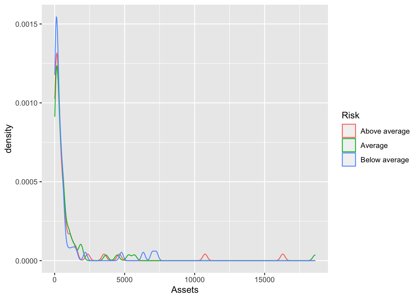 We fill the shape of density plot to try and showcase the various distributions.
Bonds %>%
    ggplot(., aes(x = Assets, fill = Risk)) + geom_density()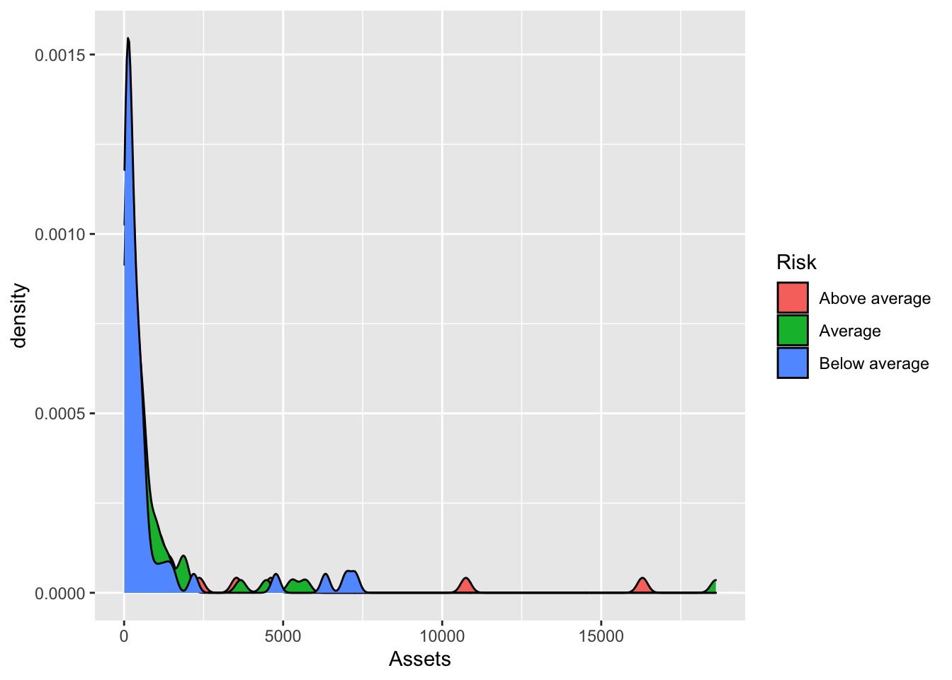
This almost always needs lightening.
Bonds %>%
    ggplot(., aes(x = Assets, fill = Risk)) + geom_density(alpha = 0.2)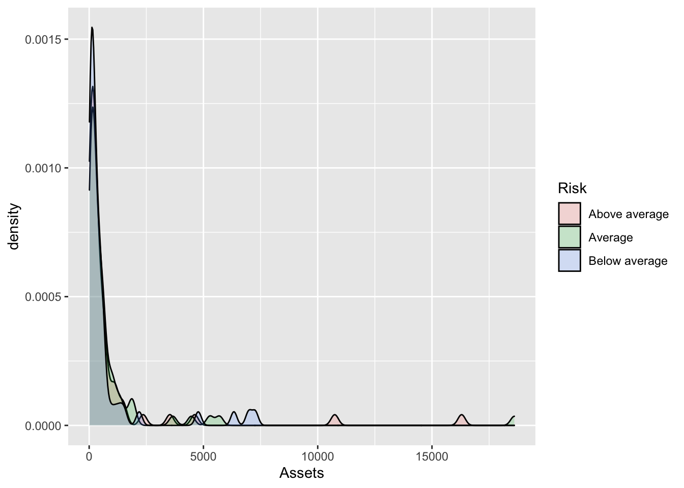
In this case, it helps to remove the outline.
Bonds %>%
    ggplot(., aes(x = Assets, fill = Risk)) + geom_density(alpha = 0.2, color = NA)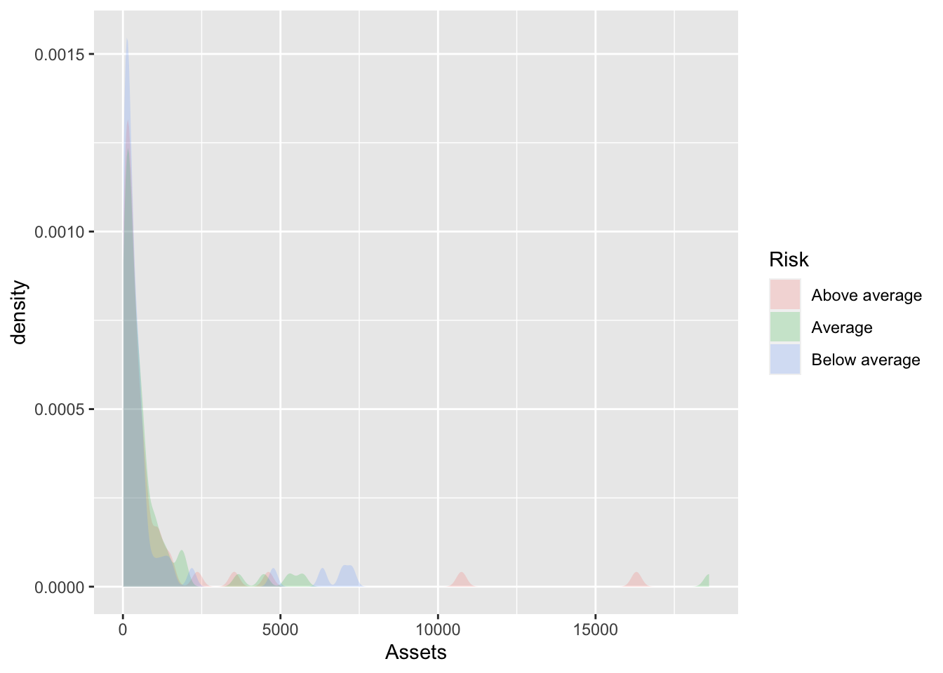
geom_beeswarm()
Related to the dotplot is the beeswarm. It requires installing a package with the geometry known as ggbeeswarm.
install.packages("ggbeeswarm")library(ggbeeswarm)
Bonds %>%
ggplot() + aes(x = Risk, y = Assets) + geom_beeswarm()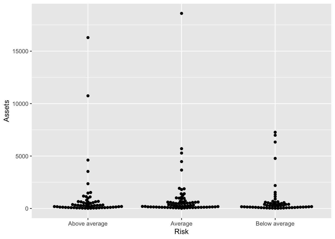
library(ggbeeswarm)
Bonds %>%
    ggplot() + aes(x = Risk, y = Assets, color = Risk) + geom_beeswarm() + guides(color = FALSE)
## Warning: `guides(<scale> = FALSE)` is deprecated. Please use `guides(<scale> =
## "none")` instead.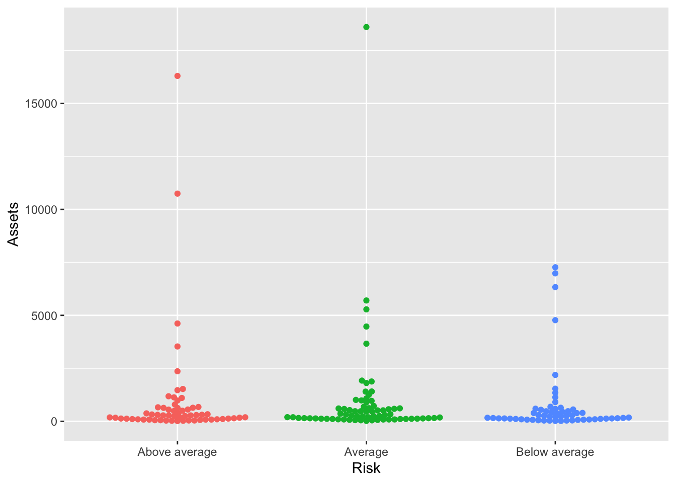
Robert W. Walker
Associate Professor of Quantitative Methods
My research interests include causal inference, statistical computation and data visualization.