Visualizing One Qualitative Variable
Bonds
A dataset for illustrating the various available visualizations needs a certain degree of richness with manageable size. The dataset on Bonds contains three categorical and a few quantitative indicators sufficient to show what we might wish.
Loading the Data
Bonds <- read.csv(url("https://raw.githubusercontent.com/robertwwalker/DADMStuff/master/BondFunds.csv"))A Summary
library(skimr)
Bonds %>%
skim()| Name | Piped data |
| Number of rows | 184 |
| Number of columns | 9 |
| _______________________ | |
| Column type frequency: | |
| character | 4 |
| numeric | 5 |
| ________________________ | |
| Group variables | None |
Variable type: character
| skim_variable | n_missing | complete_rate | min | max | empty | n_unique | whitespace |
|---|---|---|---|---|---|---|---|
| Fund.Number | 0 | 1 | 4 | 6 | 0 | 184 | 0 |
| Type | 0 | 1 | 20 | 23 | 0 | 2 | 0 |
| Fees | 0 | 1 | 2 | 3 | 0 | 2 | 0 |
| Risk | 0 | 1 | 7 | 13 | 0 | 3 | 0 |
Variable type: numeric
| skim_variable | n_missing | complete_rate | mean | sd | p0 | p25 | p50 | p75 | p100 | hist |
|---|---|---|---|---|---|---|---|---|---|---|
| Assets | 0 | 1 | 910.65 | 2253.27 | 12.40 | 113.72 | 268.4 | 621.95 | 18603.50 | ▇▁▁▁▁ |
| Expense.Ratio | 0 | 1 | 0.71 | 0.26 | 0.12 | 0.53 | 0.7 | 0.90 | 1.94 | ▂▇▅▁▁ |
| Return.2009 | 0 | 1 | 7.16 | 6.09 | -8.80 | 3.48 | 6.4 | 10.72 | 32.00 | ▁▇▅▁▁ |
| X3.Year.Return | 0 | 1 | 4.66 | 2.52 | -13.80 | 4.05 | 5.1 | 6.10 | 9.40 | ▁▁▁▅▇ |
| X5.Year.Return | 0 | 1 | 3.99 | 1.49 | -7.30 | 3.60 | 4.3 | 4.90 | 6.80 | ▁▁▁▅▇ |
Most data types are represented. There is no time variable so dates and the visualizations that go with time series are omitted.
Data Visualization
First, let us look at visualizations for one variable.
Bar plots and column plots
There are two ways to construct a barplot; we can let ggplot handle it on the raw data or calculate it ourselves. Let me focus on Risk.
geom_bar()
Bonds %>%
    ggplot() + aes(x = Risk) + geom_bar()
Raw Data Bar Plot [color]
Bonds %>%
    ggplot() + aes(x = Risk, color = Risk) + geom_bar()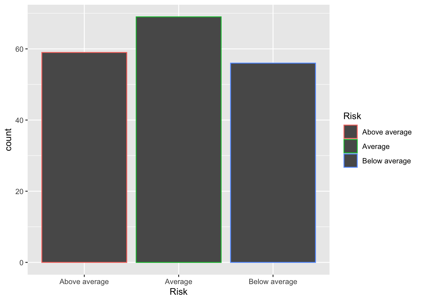
Raw Data Bar Plot [color and fill]
We could color it.
Bonds %>%
    ggplot() + aes(x = Risk, color = Risk) + geom_bar(fill = "white") + guides(color = FALSE)
## Warning: `guides(<scale> = FALSE)` is deprecated. Please use `guides(<scale> =
## "none")` instead.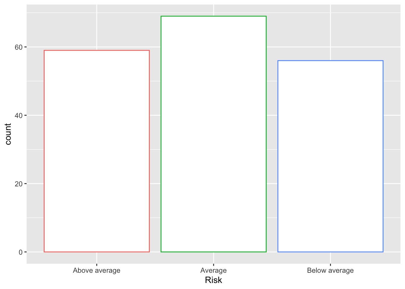
Raw Data Bar Plot [Fill]
We can fill the shapes.
# guides(fill=FALSE) removes the legend
Bonds %>%
    ggplot(., aes(x = Risk, fill = Risk)) + geom_bar() + guides(fill = FALSE)
## Warning: `guides(<scale> = FALSE)` is deprecated. Please use `guides(<scale> =
## "none")` instead.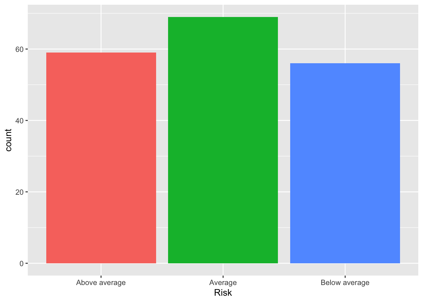
geom_bar() meets fill
We can also deploy fill but x is no longer the axis; the axis is some constant value with frequencies filled by the fill. This will require some prettying.
A Cumulative Bar Plot
Basic.Bar <- Bonds %>%
    ggplot(., aes(x = "", fill = Risk)) + geom_bar()
Basic.Bar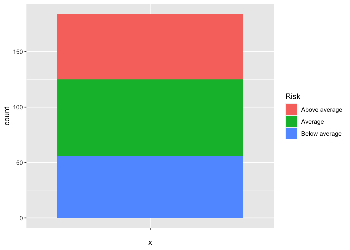
The prettying will require that I eliminate the x axis [set it to empty], include a theme, and give it proper labels.
Enhanced Cumulative Bar Plot
Bonds %>%
    ggplot(., aes(x = "", fill = Risk)) + geom_bar() + labs(x = "", y = "Number of Funds") +
    theme_minimal() + theme(axis.text.x = element_blank())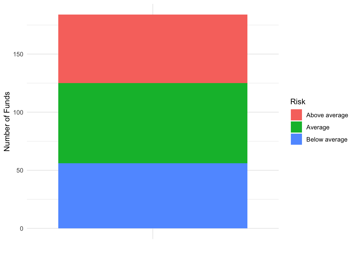
Proportion Bar Plot
Bonds %>%
    ggplot(., aes(x = "", fill = Risk)) + geom_bar(position = "fill") + labs(x = "",
    y = "Proportion of Funds")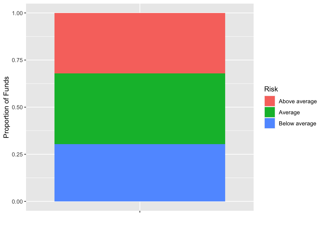
The prettying will require that I eliminate the x axis [set it to empty], include a theme, and give it proper labels.
Enhanced Proportion Bar Plot
Bonds %>%
    ggplot(., aes(x = "", fill = Risk)) + geom_bar(position = "fill") + labs(x = "",
    y = "Propotion of Funds") + theme_minimal()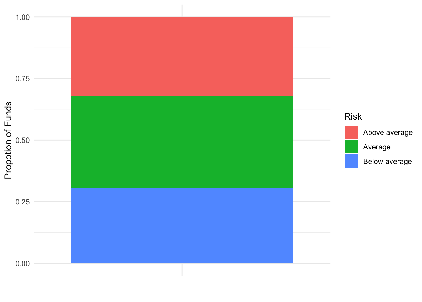
geom_col()
Risk.Table <- table(Bonds$Risk) %>%
    data.frame()
Risk.Table %>%
    ggplot(., aes(x = Var1, y = Freq)) + geom_col()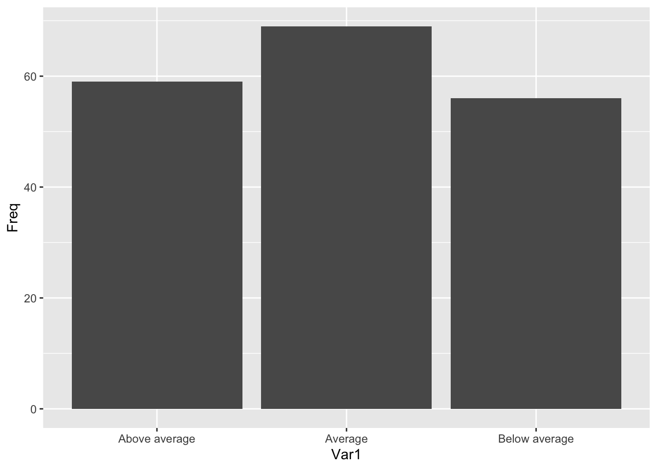
Beautifying geom_col()
Now it really needs some beautification.
Risk.Table %>%
    ggplot(., aes(x = Var1, y = Freq, fill = Var1)) + geom_col() + labs(x = "Risk Levels",
    y = "Number of Funds") + theme_minimal() + theme(axis.text.x = element_blank()) +
    scale_fill_viridis_d() + guides(fill = FALSE)
## Warning: `guides(<scale> = FALSE)` is deprecated. Please use `guides(<scale> =
## "none")` instead.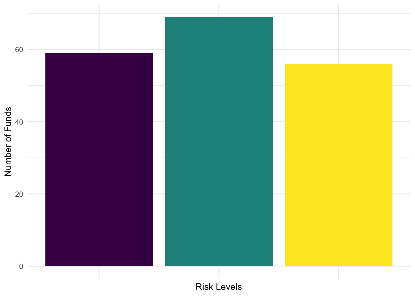
position = "fill"
The two commands are symmetric in the sense that x as axis always splits it into multiple parts. fill will prove very useful with a two dimensional table.
Risk.Table %>%
    ggplot(., aes(x = 1, y = Freq, fill = Var1)) + geom_col(position = "fill") +
    labs(x = "Risk Levels", y = "Number of Funds") + theme_minimal() + theme(axis.text.x = element_blank()) +
    scale_fill_viridis_d() + guides(fill = FALSE)
## Warning: `guides(<scale> = FALSE)` is deprecated. Please use `guides(<scale> =
## "none")` instead.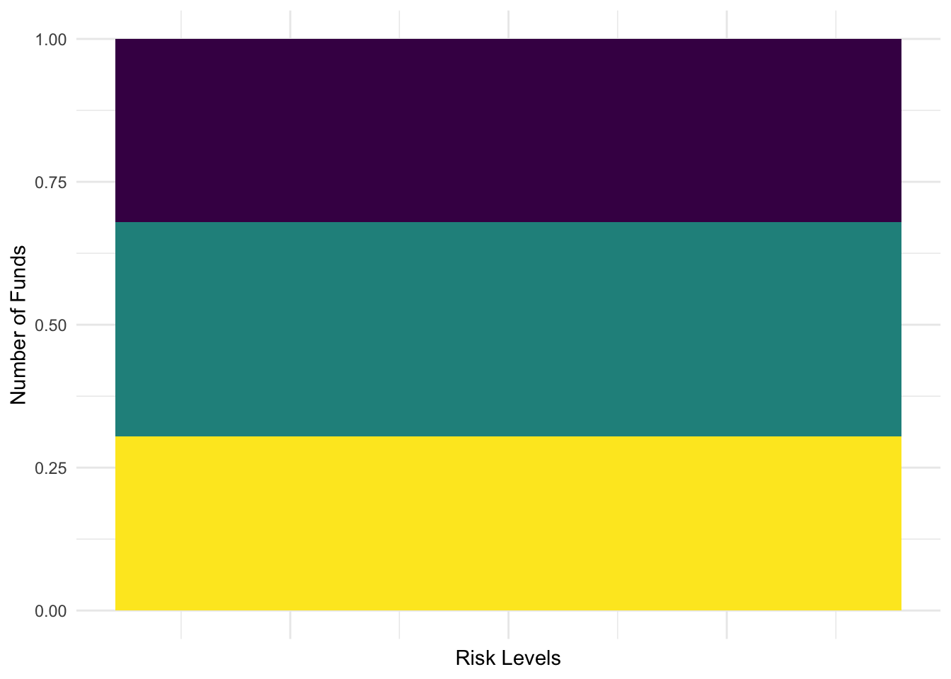
A lollipop chart
A lollipop chart is a combination of two geometries. It is a basic scatterplot combining one qualitative variable and the quantitative count of the number of observations. The head of the lollipop is a point while there is an accompanying line segment from (x,0) to (x,Freq) where Freq is the default name for a count from a table.
Basic Lollipop Chart
Risk.Table %>%
    ggplot(., aes(x = Var1, y = Freq, color = Var1)) + geom_point(size = 6) + labs(x = "Risk Level",
    y = "Number of Funds", color = "Risk Level") + geom_segment(aes(xend = Var1,
    y = 0, yend = Freq)) + theme_minimal()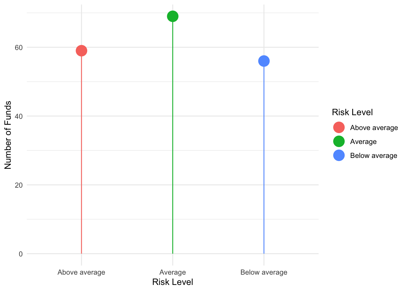
Slicked Lollipop Chart by Adjusting Segment Size
Risk.Table %>%
    ggplot(., aes(x = Var1, y = Freq, color = Var1)) + geom_point(size = 6) + labs(x = "Risk Levels",
    y = "Number of Funds") + geom_segment(aes(xend = Var1, y = 0, yend = Freq), size = 1.5) +
    theme_minimal() + guides(color = FALSE)
## Warning: `guides(<scale> = FALSE)` is deprecated. Please use `guides(<scale> =
## "none")` instead.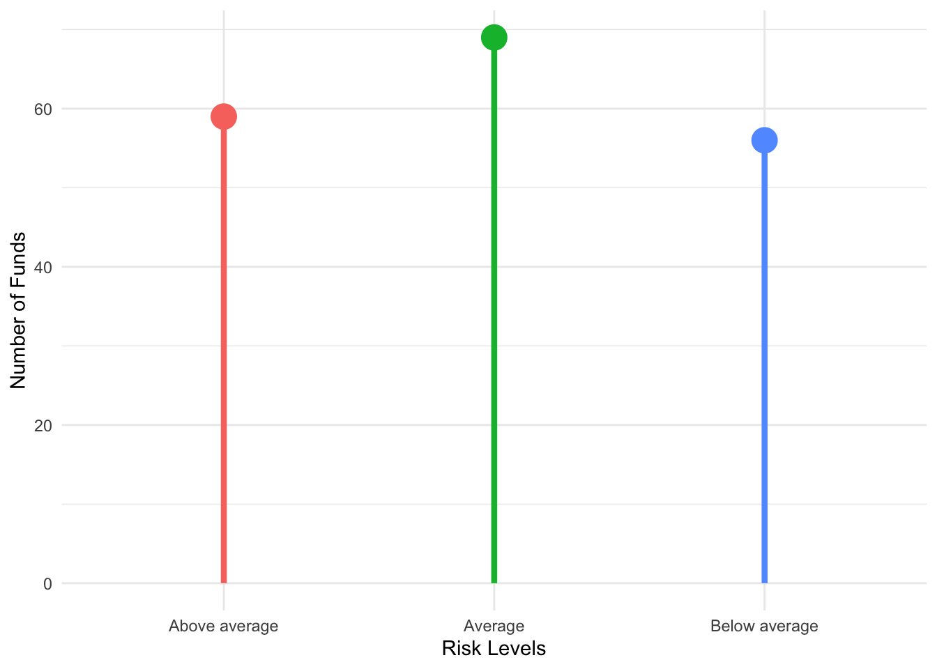
Risk.Table %>%
    ggplot(., aes(x = Var1, y = Freq, color = Var1)) + geom_point(size = 6) + labs(x = "Risk Levels",
    y = "Number of Funds") + geom_segment(aes(xend = Var1, y = 0, yend = Freq)) +
    theme_minimal() + scale_color_viridis_d() + guides(color = FALSE) + coord_flip()
## Warning: `guides(<scale> = FALSE)` is deprecated. Please use `guides(<scale> =
## "none")` instead.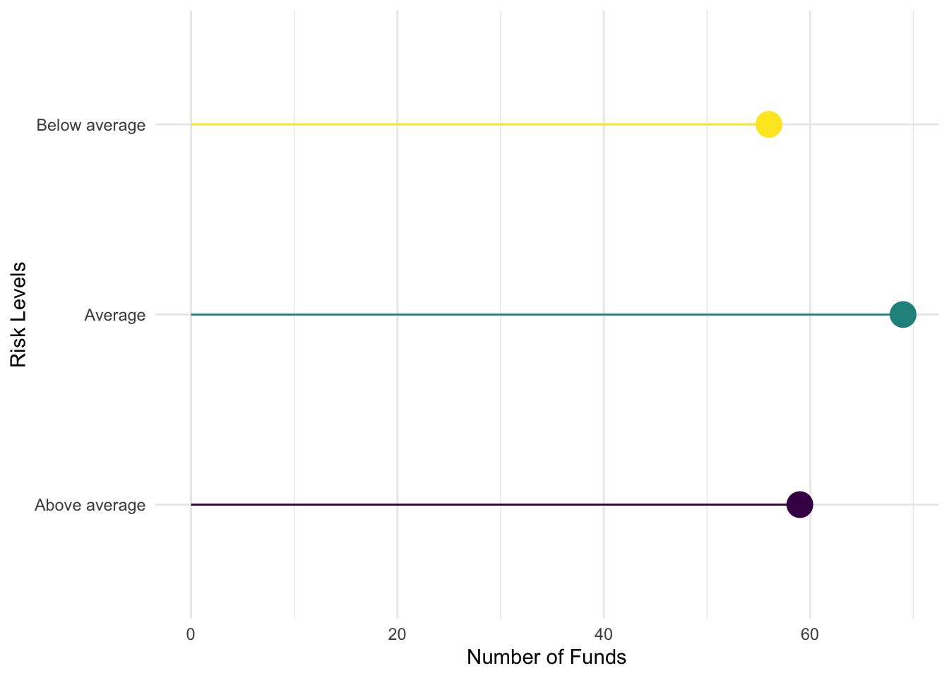
A Lollipop Table [geom_label()]
Now I will switch up the points to be the actual values as text. For this, I use the geom_text aesthetic that requires a label to be assigned. I also want to put down the lines before the text to avoid overlap.
Risk.Table %>%
    ggplot(., aes(x = Var1, y = Freq, color = Var1, label = Freq)) + labs(x = "Risk Levels",
    y = "Number of Funds") + geom_segment(aes(xend = Var1, y = 0, yend = Freq)) +
    geom_label(size = 6) + theme_minimal() + scale_color_viridis_d() + guides(color = FALSE) +
    coord_flip()
## Warning: `guides(<scale> = FALSE)` is deprecated. Please use `guides(<scale> =
## "none")` instead.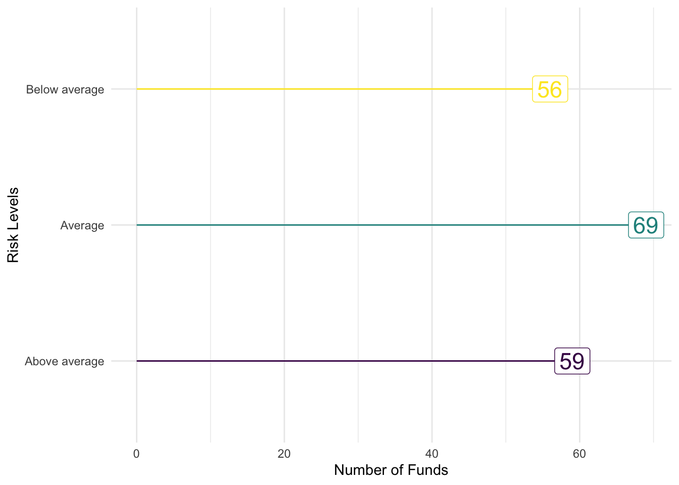
A Lollipop Table [geom_text() inverse]
The ggplot is built in layers so the segment before the label makes sure that the white shows up. The fill and a discrete color are combined to create this graphical table.
Risk.Table %>%
    ggplot(., aes(x = Var1, y = Freq, color = Var1, fill = Var1, label = Freq)) +
    geom_segment(aes(xend = Var1, y = 0, yend = Freq), size = 1.5) + geom_label(size = 6,
    color = "white") + labs(x = "Risk Levels", y = "Number of Funds") + theme_minimal() +
    scale_color_viridis_d() + scale_fill_viridis_d() + guides(fill = FALSE, color = FALSE) +
    coord_flip()
## Warning: `guides(<scale> = FALSE)` is deprecated. Please use `guides(<scale> =
## "none")` instead.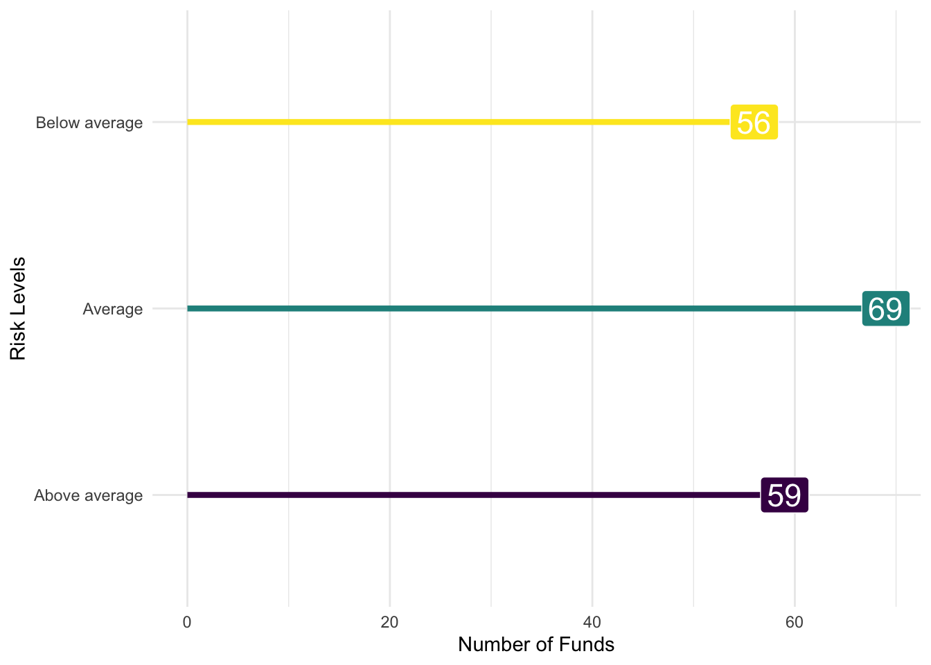
I HATE PIE CHARTS
A pie chart is fairly easy to do. Let’s go back and show something that I find pretty amazing. A pie chart is a bar chart [the fill variety] with coordinates that fill a circle rather than a square. We take the most basic bar plot – Basic.Bar – and add three things: new coordinates that are polar, labels, and a blank theme to eliminate axis labels.
Basic.Bar + coord_polar("y", start = 0) + labs(x = "", y = "") + theme_void()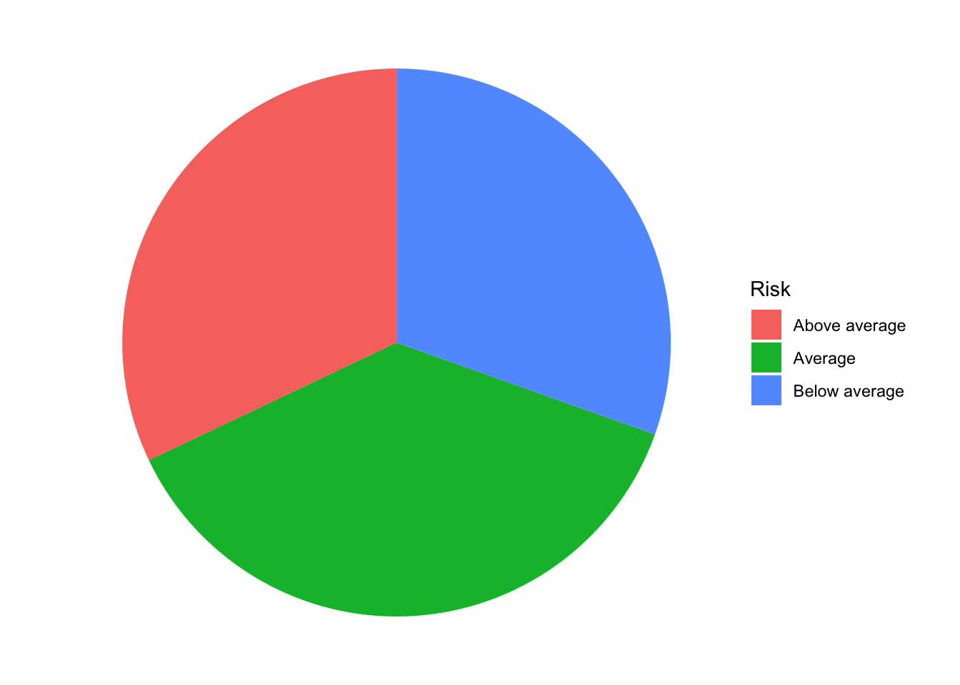
Robert W. Walker
Associate Professor of Quantitative Methods
My research interests include causal inference, statistical computation and data visualization.